We typically write blogs about what projects we are working on – a research question, an exciting piece of furniture – but I wanted to let you in on something a little more pedestrian:
One of the regular projects I work on is numbering and labeling the Cultural Properties. Each object gets a unique number to identify and differentiate it from other cultural properties.
Me at work, numbering silverware. Photo by Desai Wang, CKU ’19
The numbering system is done in two different ways here at Cranbrook. All collections have a prefix set of letters that lets us know what collection it is in. For example, there is a Brookside School Collection with the prefix “BS,” as well as collections for each of the three historic houses we oversee. Next, there is either a number to match an inventory of the collection or the year the object was created or acquired.
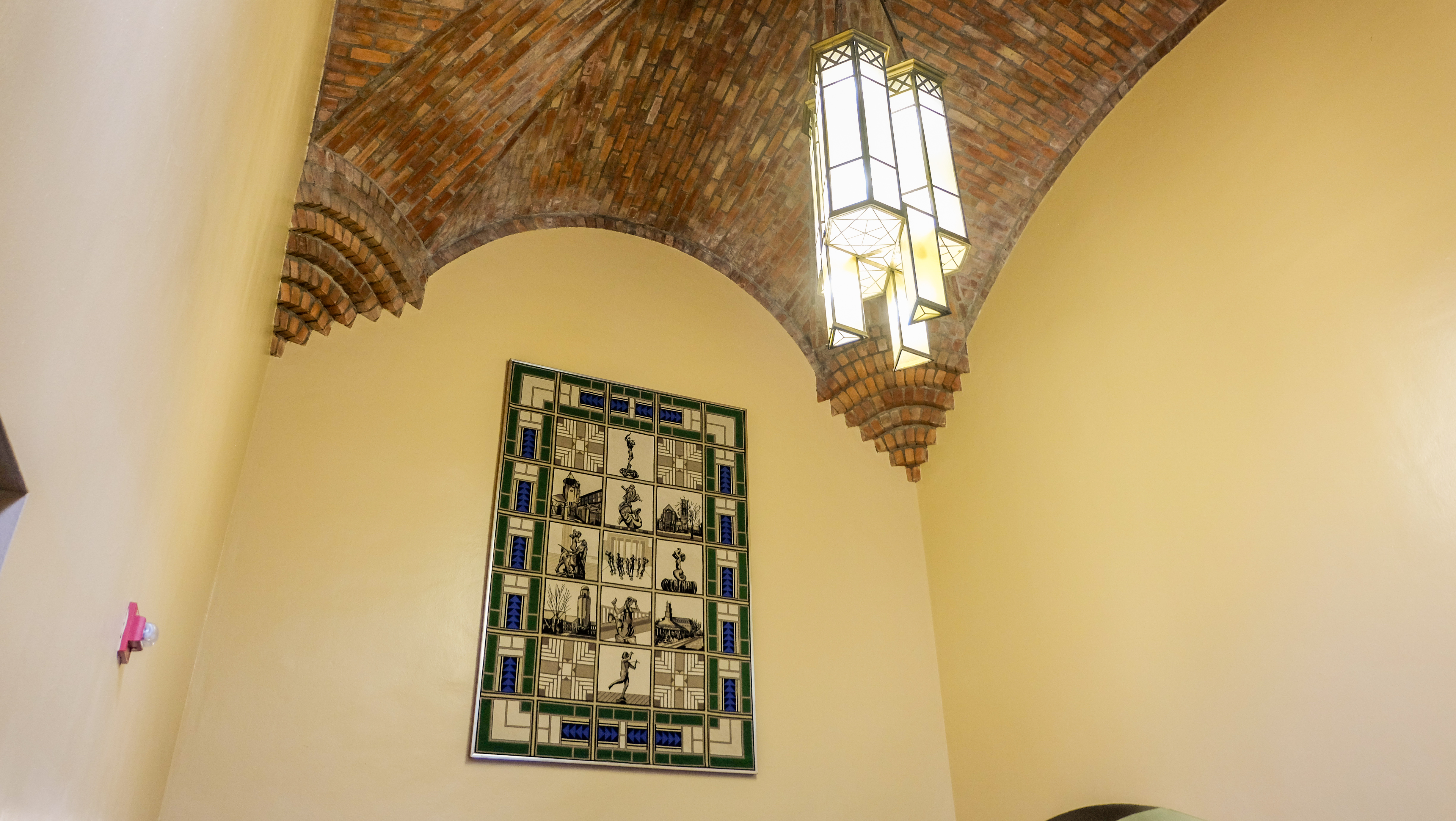
The Brookside Lobby Fixture designed by Henry Scripps Booth and created by Leonard Electric is numbered BS 1929.1. It was created in 1929 for use in the school. I haven’t been able to put the number on it yet! Photo by Daniel Smith, CAA ’21
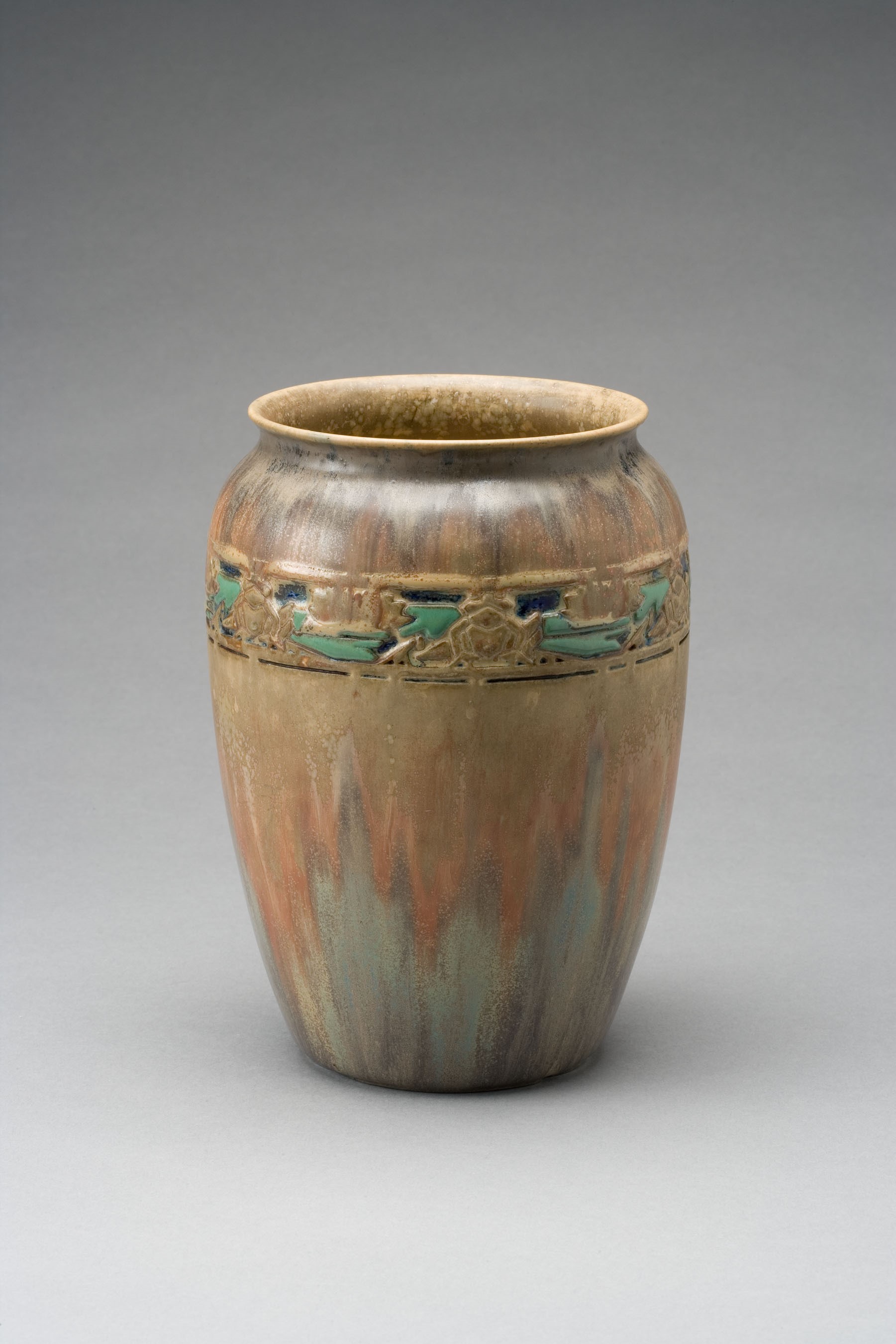
The Frog and Lily Pad Vase by Adelaide Alsop Robineau in the Founders Collection is numbered “CEC 16.” It was the 16th item cataloged in a 1975 inventory of the house. Photo by R. H. Hensleigh
Once we have numbers assigned to the object, we need to physically apply them to the object. Putting a number directly on an object is the most secure way. There are a number of techniques used to apply labels to the objects.
We currently use a method of spreading on a thin layer of special clear adhesive (B-72) to the object, putting down a number written or printed on acid-free paper, and then covering that paper with another coat of the clear adhesive. Printing the numbers on a printer allows you to control the size of the numbers (typically 7-point font) and also ensures they are legible.
A number applied to an object. This is from the Smith House collection, which the CEC acquired in 2017.
B-72, one of the tools of the trade.
There are all sorts of exceptions to the above rule: You can’t number plastics this way – the solvent in the B-72 would melt the plastic. To number them, we tie on a tag made of Tyvek using Teflon tape (also known as plumber’s tape).
Cotton twill “tape” used to number textiles.
And what about textiles? For that, we write the number on cotton twill “tape” with archival ink and sew the tags onto the objects.
Chapter 5E of Museum Registration Methods– what is referred to as the “Registrar’s Bible” — is all about marking objects, best practices, and recommended materials. When in doubt, I start there.
A recent reference request took me into the collection of the architect and interior designerBenjamin Baldwin. While the bulk of his collection contains the drafts and revisions of his autobiography, An Autobiography in Design, his collection holds an abundance of historical treasures in the form of letters, drawings, and photographs. Finishing his autobiography shortly before his death in 1993, Baldwin dedicated it to, “many who have touched my life with the magic of friendship and love.”
Such magic is timeless and ineffable; yet, a glimpse of it is captured in the trove of letters written by his friends, his fellow Cranbrook Academy of Art alumni. Baldwin won a scholarship to attend the Academy while at Princeton, where he had graduated with a bachelor’s degree in Architecture in 1935, and MFA in Architecture in 1938 following a year studying painting with Hans Hoffman.
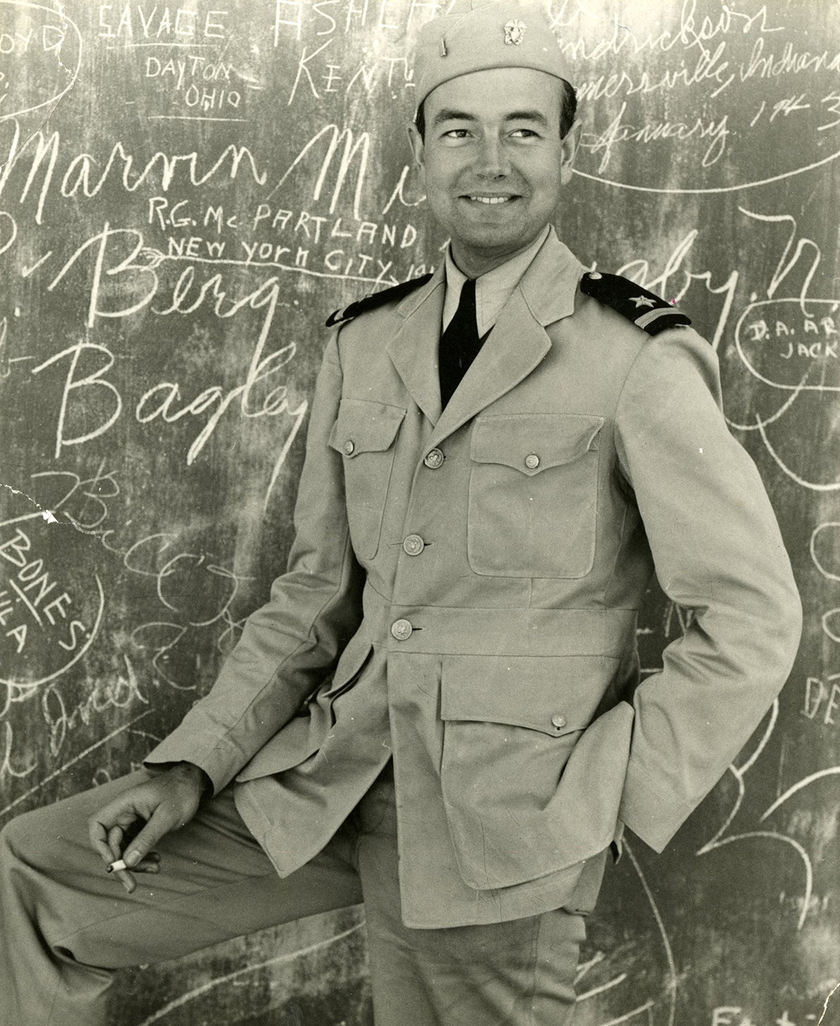
Benjamin Baldwin as a Navy ensign in Morocco in 1942. Courtesy Cranbrook Archives.
Baldwin arrived at Cranbrook in 1938, the same year as Ralph Rapsonand Charles Eames, and he formed a lifelong friendship with Harry Weese, who married Baldwin’s sister Kitty. The collection includes many letters to Harry Weese from Baldwin and others, notably Ralph Rapson, who signs himself “Le Rapson,” Wally Mitchell, Marianne Strengell, Eero Saarinen, Aline Saarinen, andLily Swann Saarinen.
Page of a letter from Ralph Rapson to Harry Weese, written despite Rapson being “not in a writing mode,” April 9, 1939. Perhaps unexpectedly, Baldwin’s collection has many letters connected to Weese but not Baldwin, likely because the collection was donated by Baldwin’s niece/Weese’s daughter, Shirley Weese Young. Courtesy Cranbrook Archives.
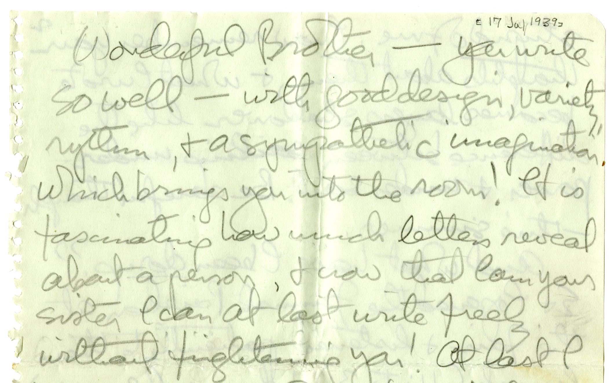
Section of letter from Lily Swann Saarinen to Harry Weese discussing the importance of letters and friendship, July 17, 1939. Courtesy Cranbrook Archives.
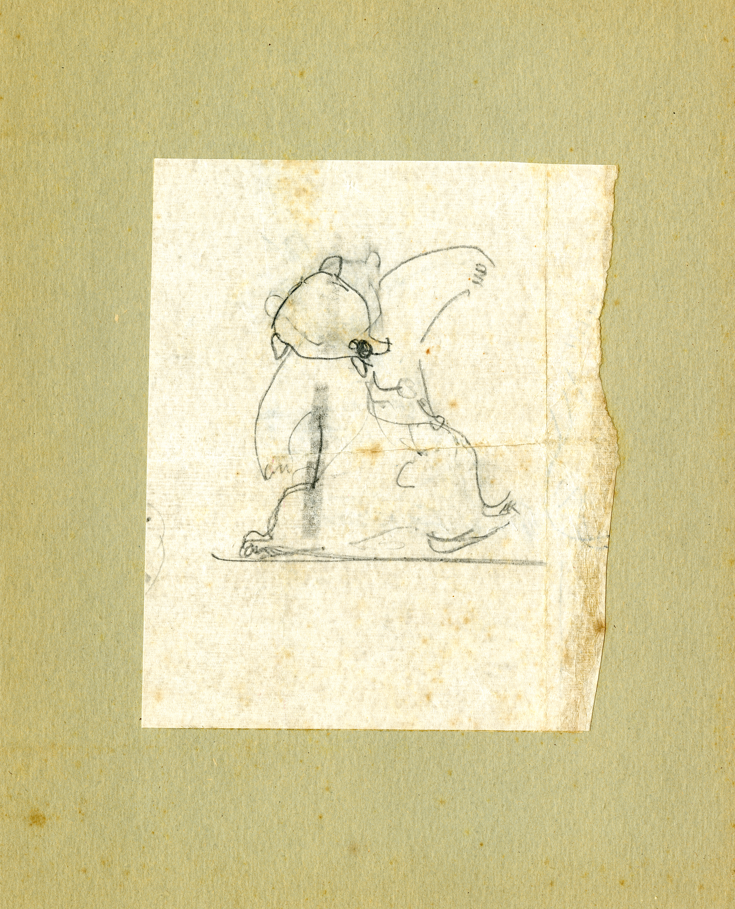
Drawing of an animal by Lily Swann Saarinen from the Baldwin collection, no date. Courtesy Cranbrook Archives.
The handwriting and the composition of these letters open a window into their world, their ideas and projects, and their hopes and concerns for each other. Certainly, this correspondence provides richer detail, and perhaps the inside view, to information found in other collections, like Rapson’s early projects in Chicago and his design for Longshadows (the Hoey summer house). It also documents events that I have previously only seen in secondary sources, such as Wally Mitchell’s car accident over the Christmas of 1942, which is poignantly described by Marianne Strengell. It is also quite striking that the gift of art is not a “thing set apart” but pervades their everyday life.
Postcard from Harry Weese to Ralph Rapson, c. 1942. Courtesy Cranbrook Archives.
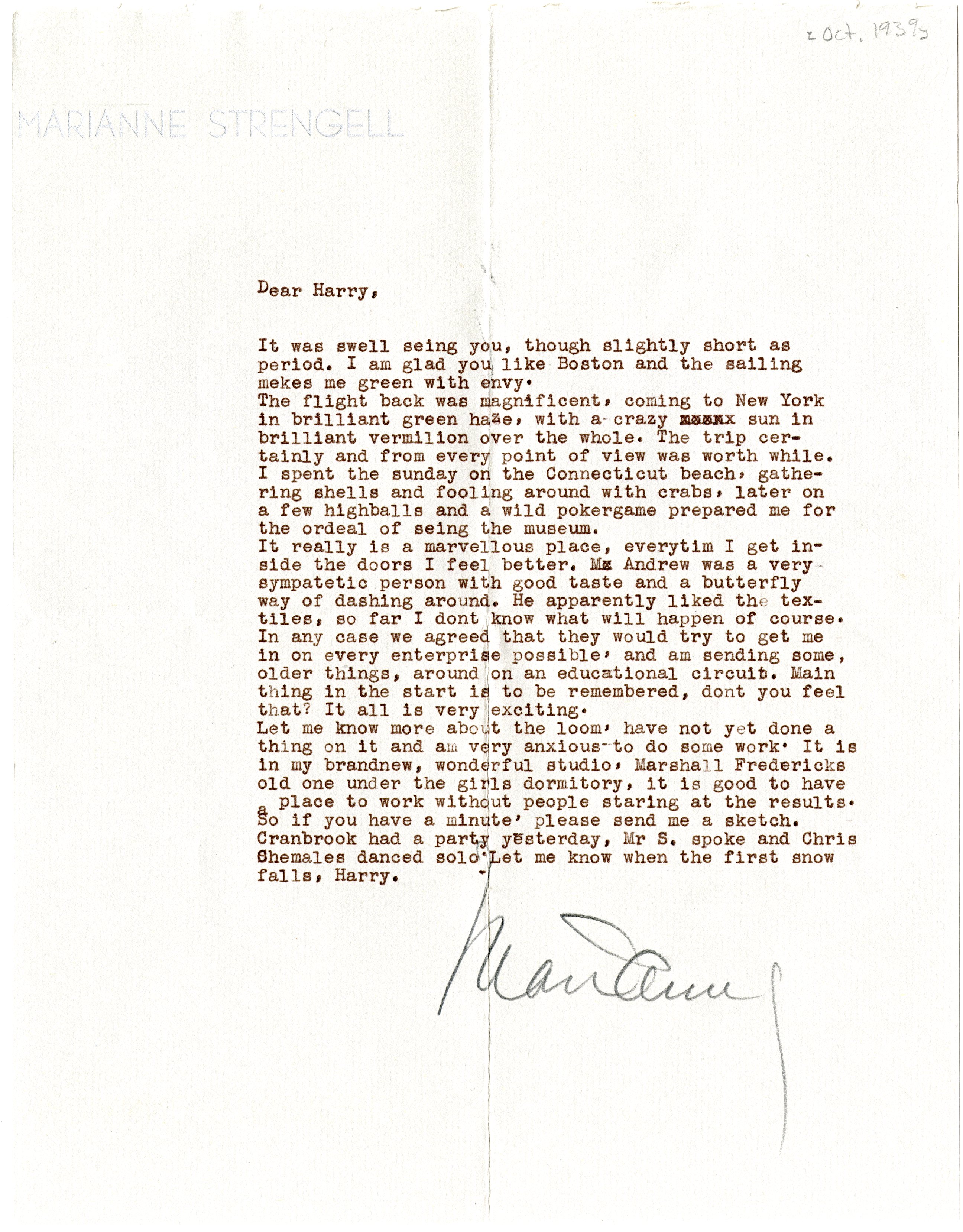
Letter from Marianne Strengell to Harry Weese, October 1939. Courtesy Cranbrook Archives.
Section of a letter from Wally Mitchell to Harry Weese, with Mitchell apologizing for his letterhead, c. 1940. Courtesy Cranbrook Archives.
During his year at Cranbrook, Baldwin and Weese built a much celebrated and sought-afterfolding loom. In the Fall of 1939, Baldwin returned to Cranbrook to work with Eliel and Eero Saarinen and J. Robert F. Swanson on the model for theSmithsonian Art Gallery competition. The submission won, but the design was never built.
In 1940, when the Smithsonian work was finished, Baldwin joined Harry Weese in Chicago, where they opened a private practice (1940-1941). The same year, they also won a competition called ‘Organic Design,’ which focused on contemporary furniture. Following Navy service during World War II, Baldwin initially worked with Skidmore, Owings and Merrill in New York before setting up an independent workshop, also in New York.
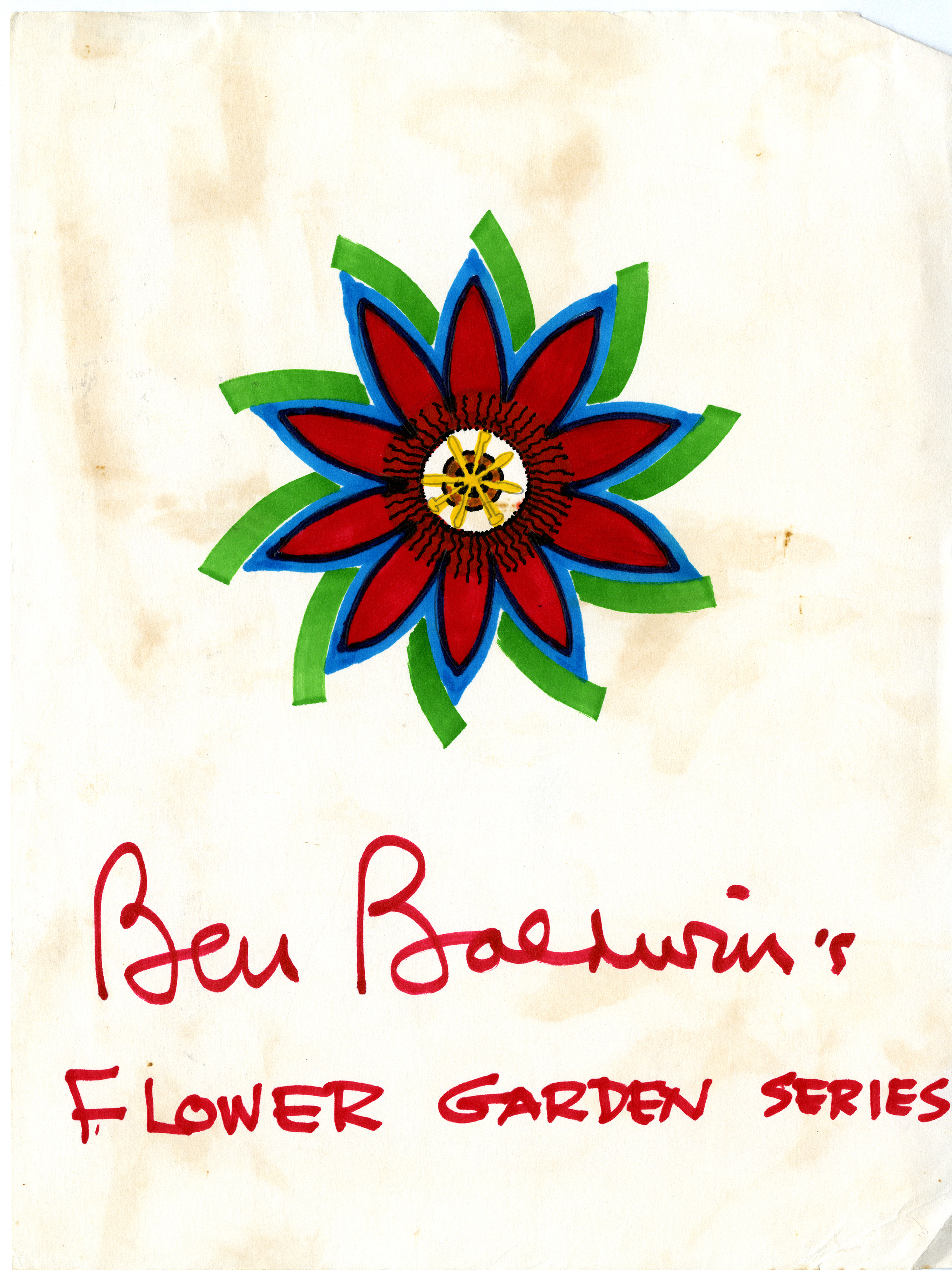
Although a registered architect, Baldwin’s career predominantly focused on interior design, including designs for furniture, textiles, chinaware, and gardens, which he loved the best. His aim was one of simplicity: flowing space and comfort to reflect the serenity that he found in nature. Baldwin’s designs for textiles and chinaware, filled with color and symmetry, are a truly wonderful part of this collection.
Ben Baldwin’s award-winning Ritz chair, 1979. Cranbrook Art Museum, Gift of Ben Baldwin.
An invitation for the opening of the Ben Baldwin Collection for Larsen Furniture, completed for fellow Cranbrook alum Jack Lenor Larsen, 1978. Courtesy Cranbrook Archives.
A design for textiles by Benjamin Baldwin, c. 1970. Courtesy Cranbrook Archives.
Ben Baldwin’s Flower Garden Series, c. 1970. Courtesy Cranbrook Archives.
A design for chinaware by Benjamin Baldwin, c. 1970. Courtesy Cranbrook Archives.
From 1973, Baldwin split his time between East Hampton, New York, and Sarasota, Florida. He died in Sarasota on April 4, 1993. He had just completed his autobiography and his niece, Shirley Weese Young, made great efforts to finalize its publication. It was published in 1995.
When I’m talking with visitors to Cranbrook about our many famous alumni, there is perhaps only one graduate whose legacy and name recognition so divides responses between “Who is that?” and “Oh-my-gosh, really?!”
If the visitor was born before 1982, they likely have never heard of her. If they’re born after 1982, they almost certainly know her—even if they don’t know she’s a real person: Lisa Frank.
A typical example of Lisa Frank’s art: unicorns, golden retrievers, pandas, and rainbows, c. 2005-2015. Copyright Lisa Frank, Inc.; courtesy of Pinterest.
Lisa Deborah Frank graduated from Kingswood in 1972. For kids in the 80s and 90s, her iconic neon designs decorated our backpacks, Trapper Keepers, pencils, folders, and stickers. Anything that you might possibly need for the daily rigors of preteen life, Lisa Frank could provide. Rainbow kittens and neon unicorns adorned practically everything, and you’d be forgiven if you chalked these creations up to the work of some anonymous office supply conglomerate with a cadre of slightly nutty illustrators.
But no. Lisa Frank is very much a real person and artist, and she has led her company, Lisa Frank, Inc., as a successful commercial art studio since 1979. Her Day-Glo depictions of flora and fauna were sensational, ubiquitous, and often imitated but never equaled. Despite her success at brightening elementary schools across the globe, as an artist and businesswoman she has been a reclusive figure. So who exactly is Lisa Frank?
In 2015, Cranbrook Kingswood alumna Carly Marks interviewed Lisa Frank at her Tucson, Arizona headquarters for the art magazine Foundations, one of the only in-depth interviews Frank has ever sat for. Frank had this to say about her time at Kingswood (1966 to 1972):
“They had real people teaching, accomplished artists. We sat in the original Saarinen chairs. I don’t think we realized what we were surrounded by. I can tell you I wouldn’t be who I am without that experience.”
There was also art at home: Lisa Frank’s father served on the board of the Detroit Institute of Arts and had an impressive collection in their Palmer Woods (Detroit) house, including works by Jasper Johns, Josef Albers, Richard Anuszkiewicz, and Jean Arp. One of Frank’s proudest moments was when her father hung one of her Kingswood-era paintings in the house—not because it was his daughter’s painting, but because he liked the work itself.
At Kingswood, Lisa Frank served on the Woodwinds yearbook staff as the advertising coordinator, among other activities. She also took advantage of the art opportunities, telling Foundations, “I had a senior show of the paintings I made…They were up on the wall, I sold out, and received a ton of commissions. Lee Iacocca, former president of Chrysler, bought a painting.”
Untitled. Lisa Frank, c. 1971-1972. Painted while Frank was a student at Kingswood School for Girls. Photo courtesy of Carly Mark for Foundations magazine, 2015.
Frank’s work at Cranbrook was abstract, using acrylic on Masonite or canvas, and sometimes incorporating paper on the canvas for additional texture. Although the work was nonrepresentational, the bright colors that would become her brand’s signature are present in these early paintings.
Untitled. Lisa Frank, c. 1971-1972. Painted while Frank was a student at Kingswood School for Girls. Photo courtesy of Carly Mark for Foundations magazine, 2015.
Her success in the Kingswood senior show led to early independence: “I lived on those earnings forever. When I was in high school [my dad] was paying for all my materials. When I got the commissions he said, ‘You’re paying for all the supplies.’ Then when I told him I was going to the University of Arizona he said, ‘That’s fine and I love you all the same but I’m not going to support you.’”
In college, Frank supported herself by selling Native American art and jewelry. She noticed what sold and what didn’t, and she encouraged the artisans she represented to make certain pieces for commercial sale. Her knack for knowing what designs would sell extended into her own art.
As she recalls, “At first I didn’t want to do unicorns. The artist in me said no. Then I thought, wait a minute, this is commercial art. Let’s do what’s going to sell.”
She started a line of jewelry made up of plastic fruits assembled with hot glue guns. She sold this line, called Sticky Fingers, at gift shows, and its success led to the establishment of her eponymous business. She entered into the pin/button market, painting licensed figures like Felix the Cat or Betty Boop, along with her own colorful animals with big eyes. These buttons were mass produced in Asia and imported to the U.S. Her breakout moment came in 1982, when teen mall staple Spencer’s Gifts ordered a million dollars’ worth of colorful Lisa Frank-designed stickers. She was only 28 years old.
Panda Painter, Lisa Frank, c. 1982-85. Frank worked with markers, acrylics, and airbrush. By 1989, the production had shifted to computer design. Artwork was created by various artists (including Rondi Kutz, Senior Designer, and Frank’s then-husband James Green, CEO) but always approved by Lisa Frank. Courtesy of Carly Marks for Foundations magazine, 2015.
Her success skyrocketed, and her technicolor art expanded onto the menagerie of product I remember from my own elementary school bookstore in the late 1990s. Since the very beginning of the company, Frank has served as the art director and sole source of product approval. Even with so many thousands of products, she and her team spend hours making each piece of new art. One thing Lisa Frank does not want? Repetition.
To her, using the same imagery over and over is not only bad business, its insulting to the customer. As she notes, “believe it or not, the consumers with less money have a keener eye than the ones with more. Consumers with less money only have so much to spend. For this reason they are critical and want to buy the best of the best. I’ve always appealed to the masses because, I felt so lucky to grow up in a beautiful world, and believe just because someone has less money, why should they not be offered the best of the best, as well?”
Trapper Keeper depicting Markie (unicorn) in Airfluff Island, Lisa Frank, Inc., c. 1990-2000. Markie was one of the early characters from Lisa Frank. According to Frank, Markie enjoys butterflies, exploring, collecting starts, cloud hopping, and dreams. Courtesy of Today.
As for her unique, technicolor style? “I think the reason I made what I made is because I’m unconventional,” she explained. “I am who I am. You read stuff about me; people think it was all influenced by drugs. You couldn’t do what I did if I was on drugs. . . I was running my business. You can’t be just a creative; you have to be a businesswoman, too. You have to have the motivation to get there.”
Panda Painter Scented Sticker sheet, Lisa Frank, Inc. c. 1990-2000. Panda Painter is seen here surrounded by rainbows and gumballs. Gumballs are a common Frank motif, inspired by a childhood gift of an antique gumball machine from her father. Copyright Lisa Frank, Inc.; scan courtesy of Nicole on Flickr.
Even at the helm of a multi-national, billion dollar company, Lisa Frank is still focused on her art: “I feel like I’m fortunate enough to live my passion…There’s a big commitment to making beautiful quality work.” She continues, “I mean, yes, it’s a business but it’s more important that the art is beautiful.”
Halloween sticker sheet, Lisa Frank, Inc. c. 1993-2000. The signature bright colors of Lisa Frank are printed using a proprietary four-color print process that keeps the colors from muddying. All licensees producing Lisa Frank, Inc. materials must sign confidentiality agreements as the ink mixtures are a closely-held secret. Copyright Lisa Frank, Inc.; scan courtesy of Nicole on Flickr.
Lisa Frank was awarded the Distinguished Alumna Award in 1994 from the Kingswood Alumnae Association. Perhaps one day we’ll even get an original Lisa Frank for Cranbrook Art Museum!
Sometimes, what appears to be a simple question doesn’t have an easy answer in the archives. By combining forces with colleagues, and looking in places you might not first suspect, you can ideally turn a boggling question into a rewarding quest. Provided, of course, you can solve the mystery! Happily, this was recently the case.
When contacted by a Kingswood School graduate about the origins of a certain sculpture that had graced the Green Lobby in the 1960s-1970s, I had two names to go on: Suki and Pam Stump Walsh. Was either of these the name of the sculptor and was the sculpture even still there? After checking several possible sources in the archives, it was time for a field trip to Kingswood. There she was opposite the green stairs, just as she had been described to me: a bronze sculpture of a girl, sitting cross-legged, head bowed, reading a book. I’d answered part of the question: she was still there.
And much to my delight there was also a plate tacked to the sculpture’s wooden pedestal. It read: “In Remembrance, Suzanne Anderson Stenglein, Class of 1947.”
Could this be Suki?
Back in Archives, I found a Suzanne Anderson in the 1947 Kingswood yearbook, Woodwinds. Next to her picture, this description: “That dashing station wagon, that’s always on the go, beautiful taste in clothes, and exciting vacations make Suki the ideal senior for every underclassman. Her pertness, her nose, and her spirit, that help to create her charm, match perfectly her conversational ability on all subjects from Broadway to baseball.”
I still didn’t know if this was the sculptor, or if it was Pam Stump, who is perhaps best known at Cranbrook for her work, Jane: Homage to Duchamp in the Kingswood courtyard. It certainly appeared to be Stump’s style. Associate Registrar Leslie Mio found a listing in Cranbrook Cultural Properties records for Suki, described as a patinated bronze sculpture attributed to Pam Stump.
Detroit native M. Pamela Stump graduated from Kingswood School in 1946. After attending the University of Michigan College of Architecture and Urban Planning for one year, she left to study sculpture under Marshall Fredericks in his Saginaw studio. Twenty-three years after leaving Kingswood, Stump, now Pamela Stump Walsh (she married Cranbrook School 1944 graduate, David E. Walsh), returned to teach sculpture. She retired in 1990, but continued creating and showing her own work throughout the state and internationally.
I appeared to have my answer, but I wanted definitive proof, and, ideally, a date. Back to Kingswood School. This time, with the help of Associate Archivist Laura MacNewman, I found the artist’s signature, and, a date!
End of story, right? Not quite. I still wondered about the sculpture’s origins. The Archives, thankfully, hold the M. Pamela Stump Papers. Consisting mainly of her Cranbrook Kingswood Chronicle, a memoir she titled, “Ubi Ignes Est or Where’s the Fire?” it provided the final details.
Stump made eighteen sculptures for Cranbrook while on the Kingswood faculty. Shortly after she started, in 1969, she was commissioned by the Class of 1947 to create a sculpture in memory of their classmate Suzanne Anderson Stenglein, who had died prematurely the year before. Stump refers to the bronze sculpture of Suzanne as Girl Reading or Suki. It was specifically designed to fit in the niche just outside the Headmistress’ office, directly opposite the staircase in the Green Lobby, and purposely placed on a revolving wooden pedestal so it could be turned 180-degrees to face the wall and enable examination of all the various textures and symbols on its surface. Stump writes, “On her body are many symbols of her life. This was easy because I had known her at Kingswood and in Saginaw.” Here you see this symbolism, along with the names of Suzanne’s schools before she came to Kingswood; her initials, S.A.; and her nickname, found on the crown of her head:
To bring things full circle: a close examination of negatives in the archives collections (identified only as “Kingswood Interiors”) found period images of the sculpture:
The Reading Girl by Pamela Stump, July 2, 1969. Bradford Herzog, photographer. Courtesy Cranbrook Archives, Cranbrook Photograph Collection.
I also learned from The Birmingham Eccentric, that Suki was the daughter of Goebel Brewing Company President Edwin John Anderson. She grew up in Saginaw, where she presumably met her husband, Harold Stenglein. The pair were married at Christ Church Cranbrook in 1955, and made their own home in Saginaw. At this juncture, little else is known about the girl behind the sculpture’s name.