When we consider historical records, even digital ones, our thoughts do not usually extend to websites. Yet, just like student newsletters or exhibition catalogs, Cranbrook’s website is a compendium of institutional information regarding the people, places, and things that make it unique. As we ourselves shift evermore towards online existences, one focus of the Archives has been on how to ensure Cranbrook’s virtual legacy.
I’m sure everyone is familiar with the expression, “What goes on the internet, stays on the internet,” or some variation thereof. Cranbrook is no exception. Fortunately, there is the Internet Archive. A non-profit American digital library, it has been saving public websites since 1996. And, courtesy of its web archives, the Wayback Machine, Cranbrook’s evolving web presence has been captured over time from its beginnings in the mid to late 1990s to today. [Interesting aside: through the Internet Archives backup protocol, Cranbrook is a part of the Bibliotheca Alexandrina, the current incarnation of the famed ancient Library of Alexandria!]
Cranbrook home page as it looked in 1997. Courtesy of the Internet Archive.
One of the quickest ways to get a snapshot of what was going on at Cranbrook in the last twenty-three years is through its website. Get lost in Cranbrook 1997 by clicking on the above homepage image and navigating through the still active links.
How about exploring Cranbrook 2007?
Cranbrook home page as it looked in 2007. Courtesy of the Internet Archive.
There are only 1,450 more site captures to delve into, if you’ve got the time! While the interactive websites of Cranbrook’s past can be accessed in this way, it is important to note that the information and files used in their creation form part of the over two million items at the Archives. For example, the main homepage image from the 1997 website, the Woodward Entrance Feature, can be found in the Archives’ Architecture Slide Collection.
View of the entrance feature from Woodward Avenue at sunset, 1996. Dan Hoffman, designer. Balthazar Korab, photographer. Copyright Balthazar Korab/Cranbrook Archives.
As increasingly digital files become the only documentation of Cranbrook activities or events, its websites are more integral to understanding the context of these records. The Archives continues to expand its digital capabilities to keep pace. In the near future, we hope to provide our own copies of Cranbrook’s various websites (with keyword search capability), side by side with the digital records from which they were created.
–Deborah Rice, Head Archivist, Cranbrook Archives Cranbrook Center for Collections and Research
Metro Detroiters, out-of-town visitors, and architectural aficionados worldwide have long admired the Penobscot Building in Detroit’s Financial District. Like its close neighbor, the Guardian Building, and the Fisher Building further north in Midtown, it is one of the city’s finest examples of art deco architecture and one of the iconic structures that still make up Detroit’s skyline today. Designed by Wirt C. Rowland of Smith, Hinchman, & Grylls, when its 47 stories were built in 1928, it was the tallest building in the city and the fourth tallest in the nation.
The Penobscot, on the National Register of Historic Places, is perhaps best known architecturally for its tiered upper seventeen floors and the exterior ornament by sculptor Corrado Parducci, whose work can be seen on many other Detroit buildings. It’s also known to locals for the red-lit globe at the top (originally designed as an aviation beacon), the legendary Caucus Club (Barbara Streisand reportedly launched her singing career here), or the famed roof observation deck which offered an excellent panorama of the city.
But, what about the interior of the Penobscot? Well it just so happens there’s a Cranbrook connection!
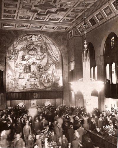
The original bank lobby. Courtesy Detroit Free Press Archives.
The Guardian Detroit Group was the first tenant of the two-story bank hall at 635 Griswold St. before they had their own skyscraper commissioned just a block away. A later occupant, Detroit City Bank, opened in the same space in February 1949. When they did, adorning one wall was a mural painted by Cranbrook Academy of Art graduate and Head of Kingswood School Art Department (1940-1956), Clifford B. West. Known as the “Mural of Michigan” the twenty-six-foot painting depicts scenes representing state commerce and industry. West, who studied under Zoltan Sepeshy, and with fellow muralist David Fredenthal, had already completed a bank mural in Alamosa, Colorado, as well as Detroit-area murals in the Rackham Building, Stockholm Restaurant, and Fox & HoundsRestaurant.
Clifford and Joy Griffin West work on the mural. Cranbrook Archives.
The mural’s upper left quadrant. Cranbrook Archives.
Following a meticulous process that involved a series of sketches at different scales, cartoons plotted to a numbered grid and traced on the wall, and painting in two steps (large blocks of color followed by detail work), the scenes were applied in casein tempera on canvas cemented to the wall. Joining in this process was West’s wife and fellow artist, Joy Griffin West, and several academy students. Fortuitously, each stage of work was captured in a series of photographs by Cranbrook photographer, Harvey Croze.
This slideshow requires JavaScript.
Upon completion of the mural, West mounted an exhibit at Cranbrook Art Museum titled, Progress of a Mural in April 1949, detailing his process for the Penobscot mural, and featuring many of the preliminary sketches and cartoons.
It’s largely unknown whether the Penobscot mural exists today, since a drop ceiling was installed many years ago, completely obscuring West’s creation.
Today is Black Friday, but did you know tomorrow is Small Business Saturday? Started nine years ago to encourage patronage of locally owned and operated shops, this Saturday after Thanksgiving event isn’t the first attempt to attract shoppers to help sustain a neighborhood economy. In Detroit in the 1960s and 70s, few did it with more aplomb and civic mindedness than Edward and Ruth Adler Schnee.
While assisting Cranbrook Art Museum staff with preparation for their upcoming exhibit Ruth Adler Schnee – Modern Designs for Living, I had the opportunity to learn more about Ruth and Edward’s Detroit retail business. Started in 1948 as a fabric design and silk screening business on 12th Street, it was their flagship store (and final location of four) that especially caught my interest. It was this store that uniquely illustrates Edward’s business acumen, Ruth’s design talent, and the couple’s dedication to the city of Detroit.
Flyer for Harmonie Park store opening, 1964. Copyright Cranbrook Archives.
When Adler/Schnee moved its operation of sixteen years from Northwest Detroit to Harmonie Park in 1964, its owners had more than just profits in mind. In form letters found in their collection, Ed Schnee writes to announce the official opening of their new location:
Since your interest and concern in the future of ‘Downtown Detroit’ is well known and ably evidenced, you may be interested to know that … we have recently moved. Mrs. Schnee and I have watched the growth of the central city with great interest for the past several years and now feel that we can make a contribution to this growth and participate actively in the new manifestation of vitality in Downtown and confidently link our future to this area. It is our earnest desire to so conduct our specialty shop that it will be a stimulating force in the Central Business District and in particular, Harmonie Park, which we feel has the potentiality of a charming little Parisian Square.
That December, Adler/Schnee had already banded with local merchants in events designed to create interest in the neighborhood and its businesses. As the November 11, 1964 Downtown Monitor stated: “It begins to look as though the wise merchants of Harmonie Park are going to create a stir among less aware business men [of] the downtown area. Watch for their latest combined effort, “Holiday Lark on Harmonie Park” – complete with a rolling chestnut roaster, popcorn wagon, gay holiday decorations and maybe even a choral concert by the Club Harmonie itself.”
Front page of flyer for Harmonie Park shopping event. Copyright Cranbrook Archives.
Back page of flyer for Harmonie Park shopping event. Copyright Cranbrook Archives.
Adler/Schnee’s advertisement for the event demonstrates their enthusiasm, “Adler/Schnee FUN FAIR: Fabulous Fripperies, Frivolous Fantasies, Functional Furnishings from far-flung lands. For family – friends – home – office – etc.” A version of ‘Holiday Lark’ was still going strong in 1976, as evidenced by a Detroit Free Press headline: “A Languorous Experience – Harmonie Park in Tune with the Season” and this flyer:
Christmas Walk event flyer with logo designed by Ruth Adler Schnee. Copyright Cranbrook Archives.
These holiday events were just one of many Harmonie Park happenings, and until the business was sold in 1977, the Schnee’s ‘modern general store’ was an important part of Detroit’s economic and cultural history. A mainstay in an enclave of art-related commerce, also anchored by the Detroit Artists’ Market, Ruth and Edward’s retail store became a destination. The many clippings, correspondence, and advertisements in their collection are testament to a business philosophy that encompassed their immediate surroundings, with such efforts as the Harmonie Park Improvement Plan, and the purchaseof their building in 1971 to preserve its 1901 architecture and utilize its seven floors to create a design center. Throughout a period that would span both civil and economic upheaval, Adler/Schnee was a bright spot (literally and figuratively) in the city’s landscape.
Read more about the Schnee’s retail business or learn more about the remarkable designer, Ruth Adler Schnee, in the Edward and Ruth Adler Schnee Papers, or in the upcoming Schnee exhibition at Cranbrook Art Museum, December 14th through March 15, 2020.
This week, we’re proud to announce that the Center is launching its first online exhibition! With the tireless efforts of the Center’s Administrative Assistant and resident website guru, Alissa Seelmann-Rutkofske, we have adapted my 2018 exhibition Saarinen House: Presidents/Residents, 1946-1994 for the web.
Installation view of Saarinen House: Presidents/Residents, 1946-1994. You can learn much more about the content of the show in the new online exhibition, or learn about the display system here. July 2018, Meng Li, photographer.
The show, which was on display in Saarinen House from April to November 2018, focuses on the first five Presidents of Cranbrook Academy of Art. These were the only five leaders to live in Saarinen House (built to be the President’s residence) and the only five who held the title “President” (we now have Directorsof the Academy and a Presidentof Cranbrook Educational Community).
In the online exhibition, you will learn about President Eliel Saarinen and the four subsequent presidents: Zoltan Sepeshy, Glen Paulsen, Wallace Mitchell, and Roy Slade. Each man’s page features a short biography, history of their artistic practice, and an account of the Academy under their leadership. Their tenure is documented through photographs from Cranbrook Archives, showing the presidents and their era of the Academy (including publications, Museum exhibitions, protests, parties, and other examples of student life and strife).
You’ll also find an Exhibition Checklistof the paintings and drawings from each president that were included in the show; click on the title of each work to see a larger image. Also online are photographs of the Exhibition Installation and information about the design and construction of our custom-made displays.
Exhibitions are a lot of research and work, and once they’re deinstalled it can feel like all the effort was for naught. Using the show’s text and images, documentary photography from P.D. Rearick, and with the encouragement of the Center’s Director, Greg Wittkopp, I am happy that Presidents/Residents and the efforts that went into its physical production will live on in digital form. Please go take a click around, and let me know what you think.
“My work here is done!” The curator in a moment of repose during the installation of Presidents/Residents. Seen sitting in a Platner chair that belonged to Roy Slade, and is currently back in use at the Academy administration offices, but was used in Saarinen House from 1977 to around 1990 and again during the exhibition. April 2018, Ashley Bigham, photographer.
A recent reference request took me into the collection of the architect and interior designerBenjamin Baldwin. While the bulk of his collection contains the drafts and revisions of his autobiography, An Autobiography in Design, his collection holds an abundance of historical treasures in the form of letters, drawings, and photographs. Finishing his autobiography shortly before his death in 1993, Baldwin dedicated it to, “many who have touched my life with the magic of friendship and love.”
Such magic is timeless and ineffable; yet, a glimpse of it is captured in the trove of letters written by his friends, his fellow Cranbrook Academy of Art alumni. Baldwin won a scholarship to attend the Academy while at Princeton, where he had graduated with a bachelor’s degree in Architecture in 1935, and MFA in Architecture in 1938 following a year studying painting with Hans Hoffman.
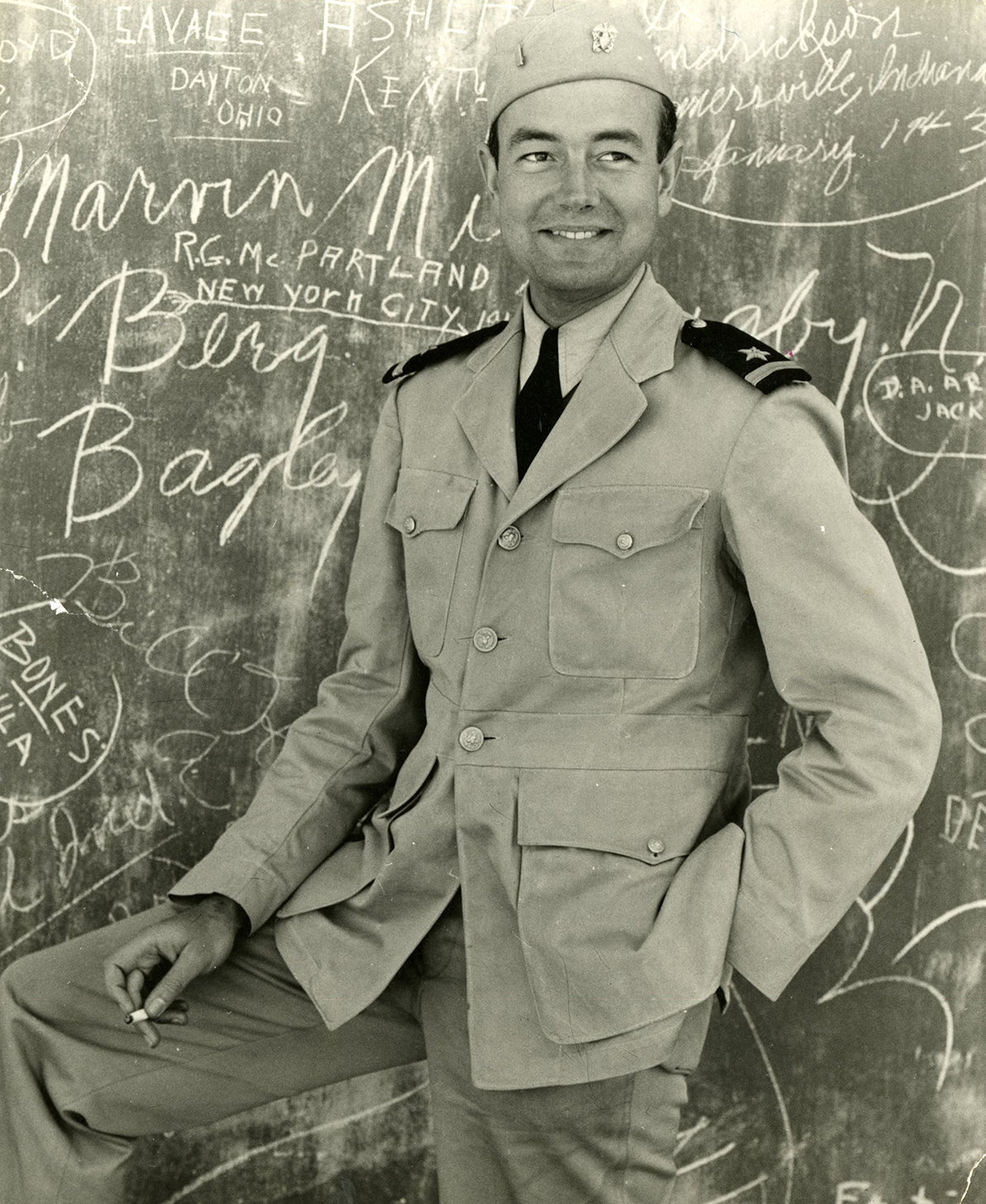
Benjamin Baldwin as a Navy ensign in Morocco in 1942. Courtesy Cranbrook Archives.
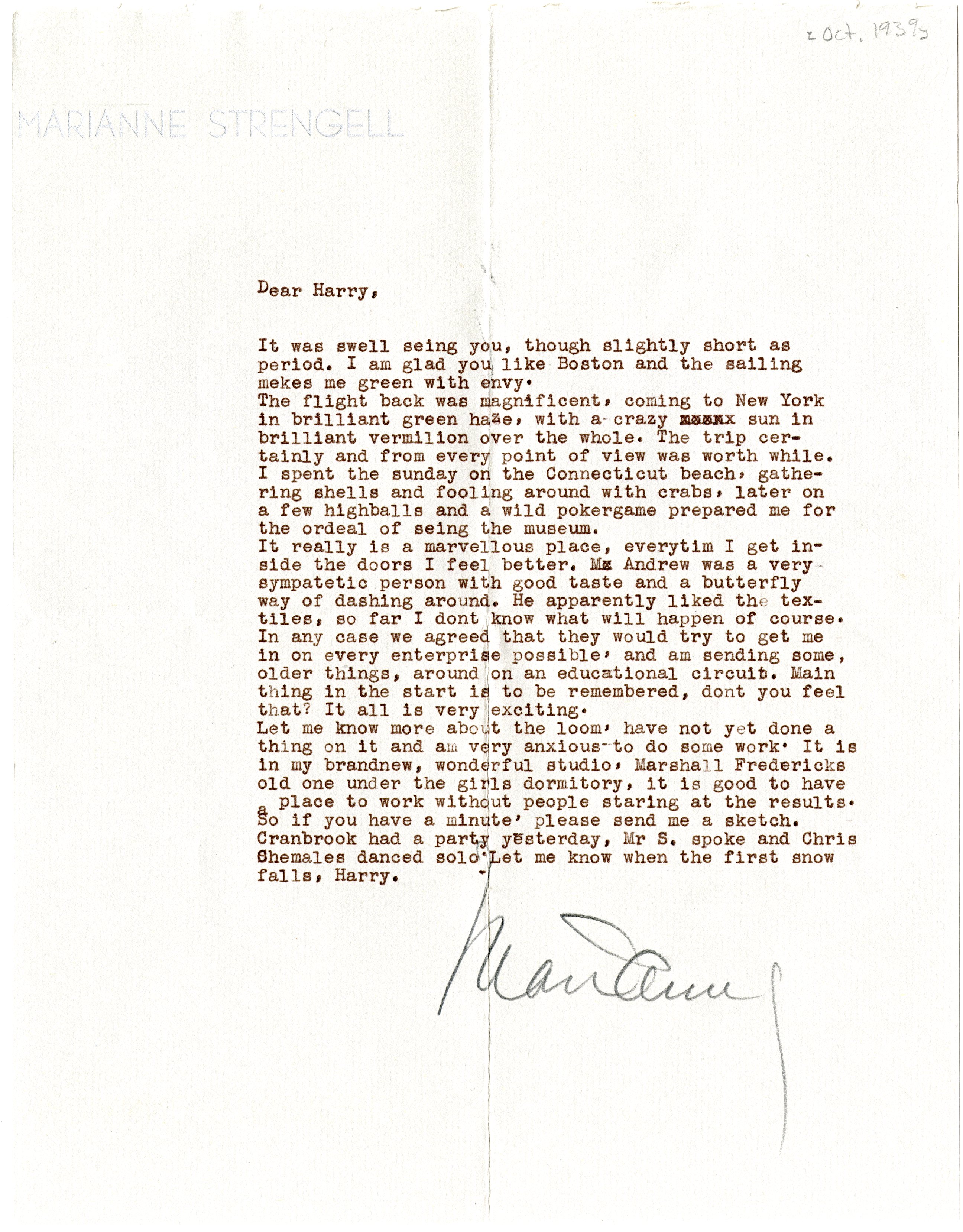
Baldwin arrived at Cranbrook in 1938, the same year as Ralph Rapsonand Charles Eames, and he formed a lifelong friendship with Harry Weese, who married Baldwin’s sister Kitty. The collection includes many letters to Harry Weese from Baldwin and others, notably Ralph Rapson, who signs himself “Le Rapson,” Wally Mitchell, Marianne Strengell, Eero Saarinen, Aline Saarinen, andLily Swann Saarinen.
Page of a letter from Ralph Rapson to Harry Weese, written despite Rapson being “not in a writing mode,” April 9, 1939. Perhaps unexpectedly, Baldwin’s collection has many letters connected to Weese but not Baldwin, likely because the collection was donated by Baldwin’s niece/Weese’s daughter, Shirley Weese Young. Courtesy Cranbrook Archives.
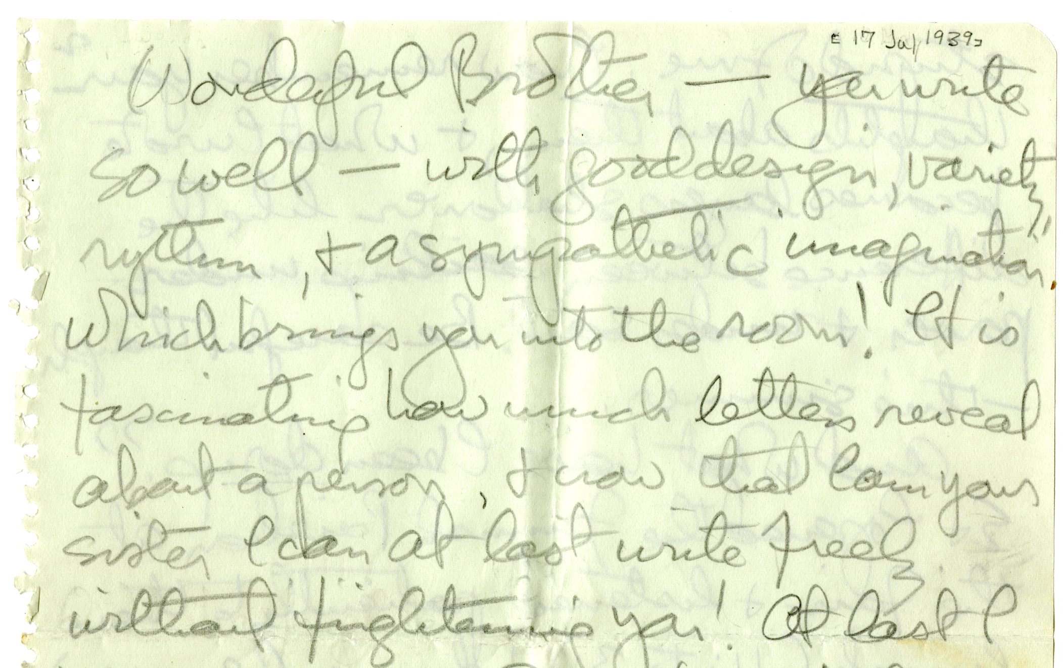
Section of letter from Lily Swann Saarinen to Harry Weese discussing the importance of letters and friendship, July 17, 1939. Courtesy Cranbrook Archives.
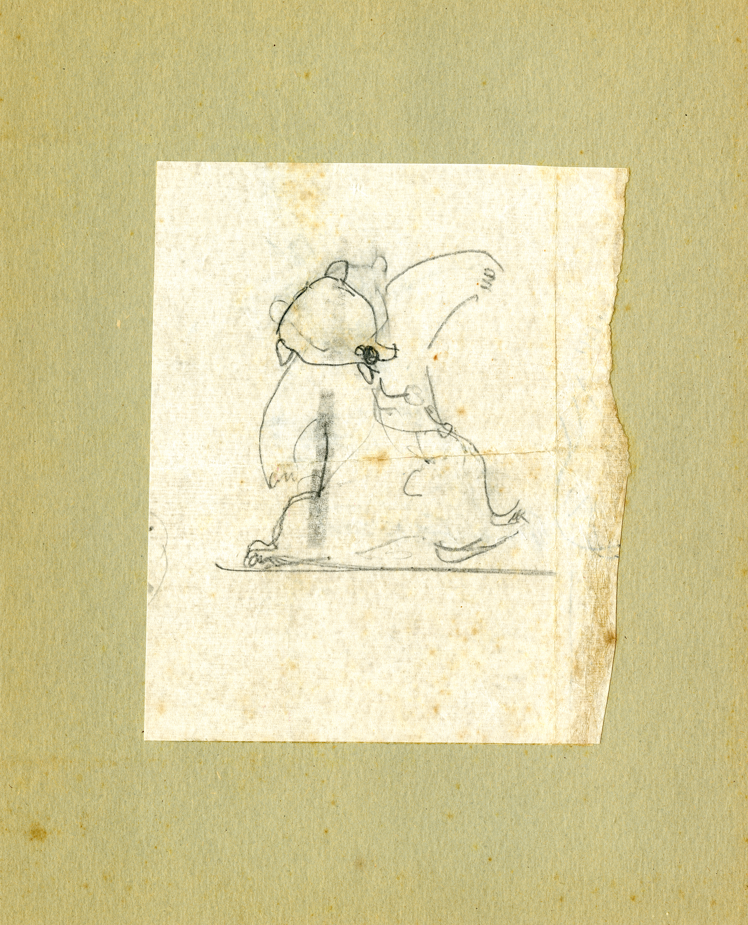
Drawing of an animal by Lily Swann Saarinen from the Baldwin collection, no date. Courtesy Cranbrook Archives.
The handwriting and the composition of these letters open a window into their world, their ideas and projects, and their hopes and concerns for each other. Certainly, this correspondence provides richer detail, and perhaps the inside view, to information found in other collections, like Rapson’s early projects in Chicago and his design for Longshadows (the Hoey summer house). It also documents events that I have previously only seen in secondary sources, such as Wally Mitchell’s car accident over the Christmas of 1942, which is poignantly described by Marianne Strengell. It is also quite striking that the gift of art is not a “thing set apart” but pervades their everyday life.
Postcard from Harry Weese to Ralph Rapson, c. 1942. Courtesy Cranbrook Archives.
Letter from Marianne Strengell to Harry Weese, October 1939. Courtesy Cranbrook Archives.
Section of a letter from Wally Mitchell to Harry Weese, with Mitchell apologizing for his letterhead, c. 1940. Courtesy Cranbrook Archives.
During his year at Cranbrook, Baldwin and Weese built a much celebrated and sought-afterfolding loom. In the Fall of 1939, Baldwin returned to Cranbrook to work with Eliel and Eero Saarinen and J. Robert F. Swanson on the model for theSmithsonian Art Gallery competition. The submission won, but the design was never built.
In 1940, when the Smithsonian work was finished, Baldwin joined Harry Weese in Chicago, where they opened a private practice (1940-1941). The same year, they also won a competition called ‘Organic Design,’ which focused on contemporary furniture. Following Navy service during World War II, Baldwin initially worked with Skidmore, Owings and Merrill in New York before setting up an independent workshop, also in New York.
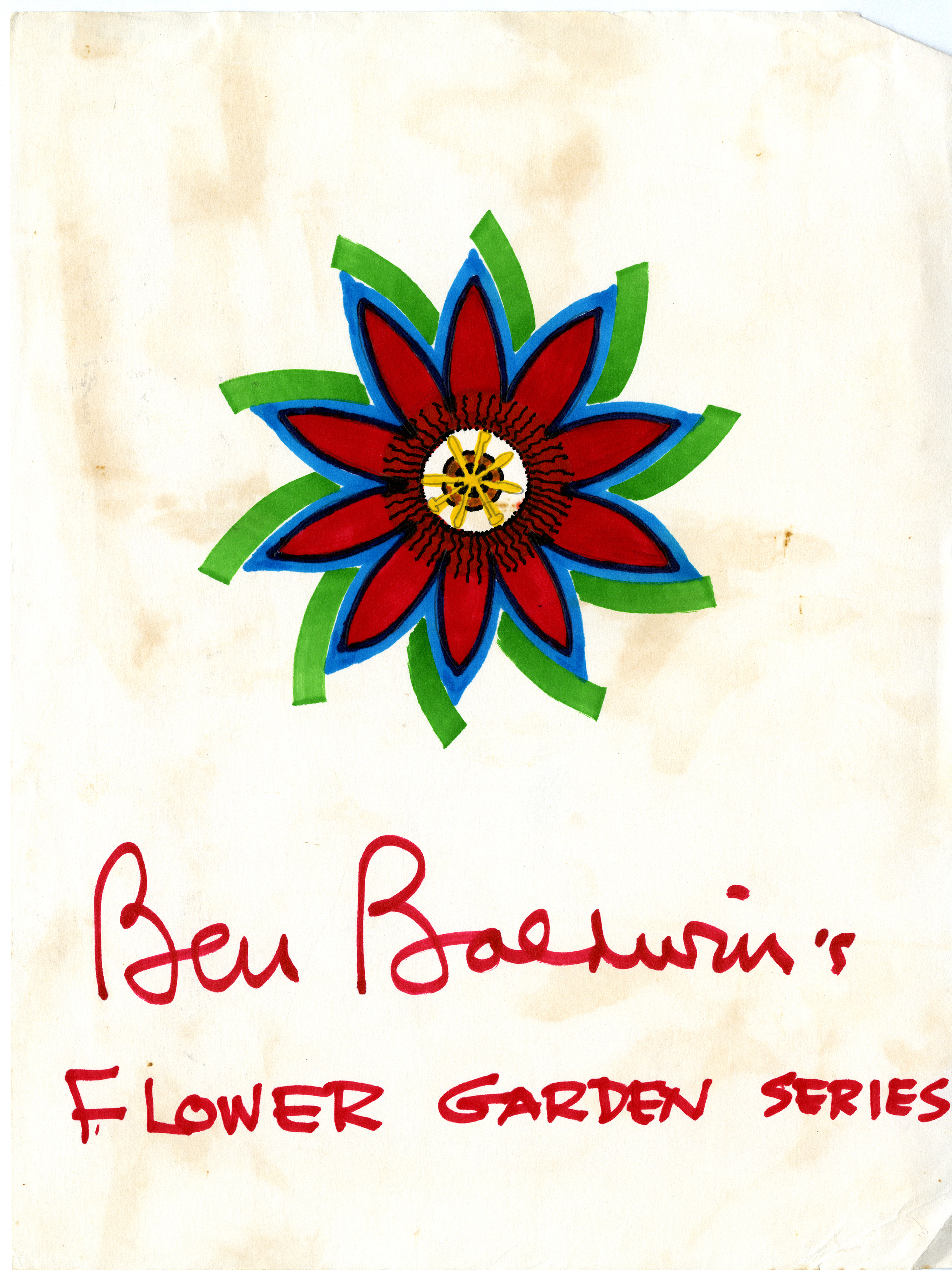
Although a registered architect, Baldwin’s career predominantly focused on interior design, including designs for furniture, textiles, chinaware, and gardens, which he loved the best. His aim was one of simplicity: flowing space and comfort to reflect the serenity that he found in nature. Baldwin’s designs for textiles and chinaware, filled with color and symmetry, are a truly wonderful part of this collection.
Ben Baldwin’s award-winning Ritz chair, 1979. Cranbrook Art Museum, Gift of Ben Baldwin.
An invitation for the opening of the Ben Baldwin Collection for Larsen Furniture, completed for fellow Cranbrook alum Jack Lenor Larsen, 1978. Courtesy Cranbrook Archives.
A design for textiles by Benjamin Baldwin, c. 1970. Courtesy Cranbrook Archives.
Ben Baldwin’s Flower Garden Series, c. 1970. Courtesy Cranbrook Archives.
A design for chinaware by Benjamin Baldwin, c. 1970. Courtesy Cranbrook Archives.
From 1973, Baldwin split his time between East Hampton, New York, and Sarasota, Florida. He died in Sarasota on April 4, 1993. He had just completed his autobiography and his niece, Shirley Weese Young, made great efforts to finalize its publication. It was published in 1995.
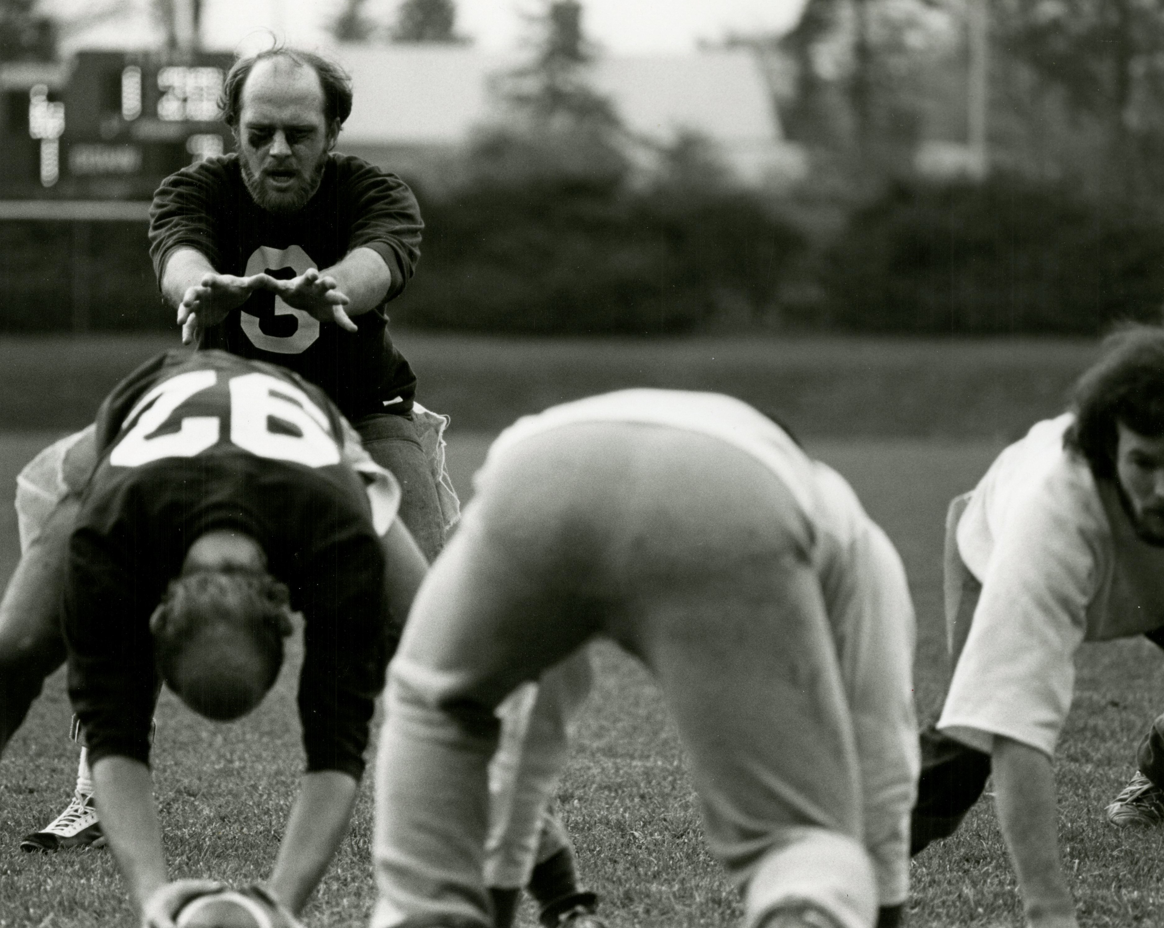
You probably know Cranbrook Kingswood Upper School has a football team, and you might remember that the Detroit Lions held training camps here in the 1970s, but did you also know that Cranbrook Academy of Art is an undefeated intercollegiate football team?
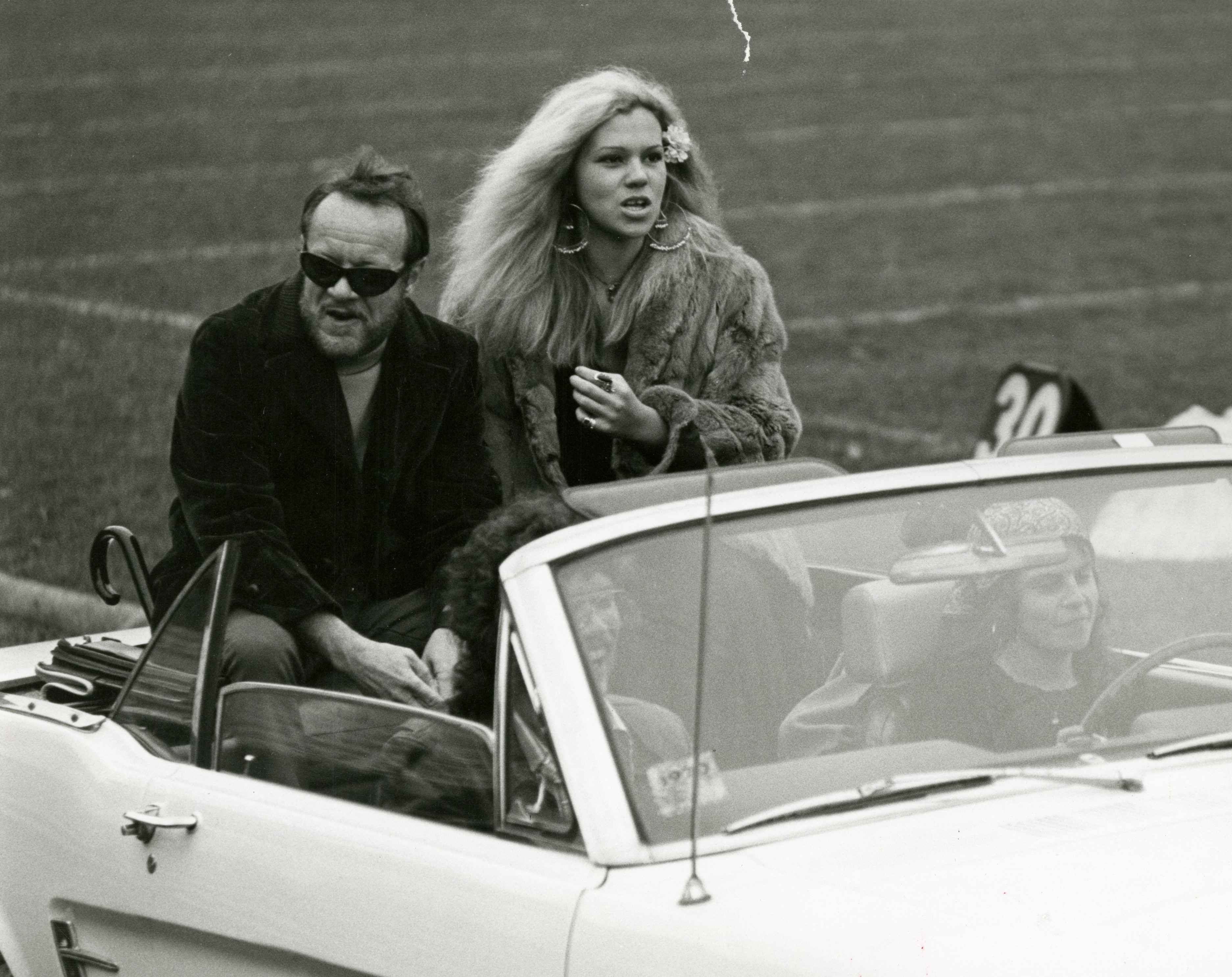
Homecoming Queen Barbara Tiso takes a convertible ride around the field with Academy President Wallace Mitchell. Cranbrook Archives.
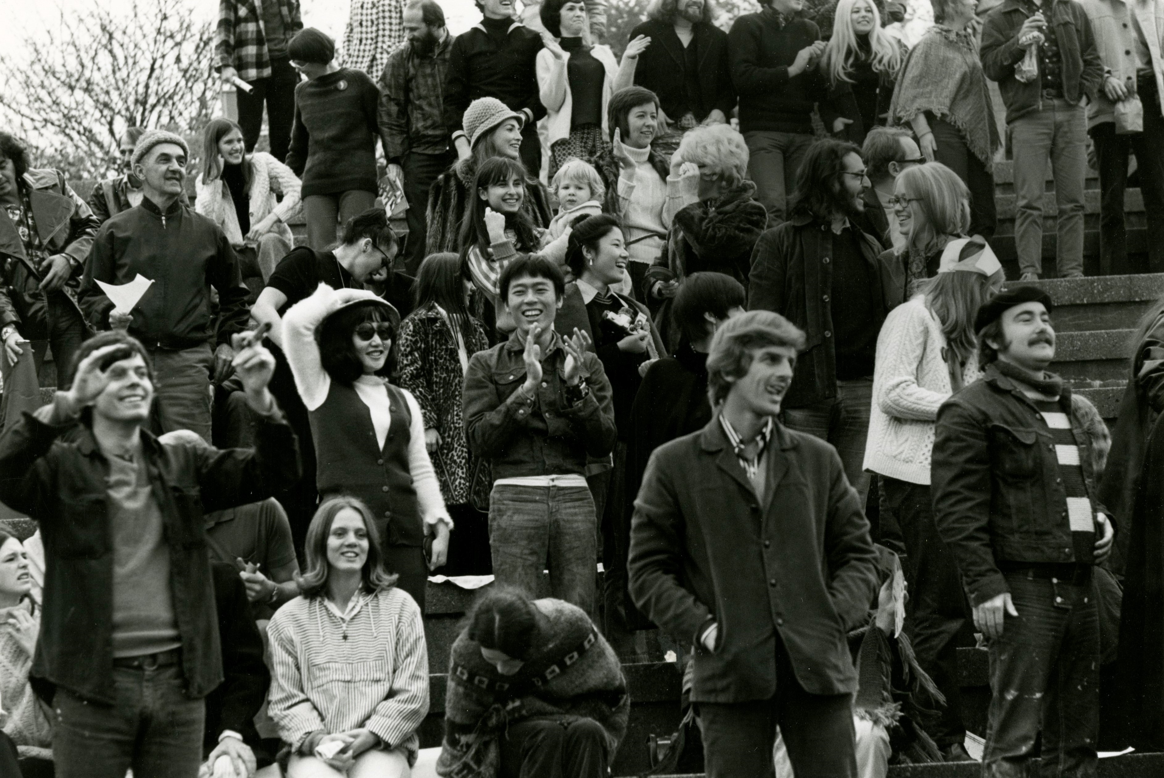
As The Cranbrook Magazine reported in the Winter 1971 issue, “Before winter zeroed in [the Academy] had a rousing football weekend similar in events, at least, to those at large universities that specialize in such things.” There was a bonfire pep rally, organized cheering sections, a Homecoming Queen, the game itself with a halftime show from both schools, and a victory banquet.
Sculpture head Michael Hall regarded the weekend as a conceptual art project, and said “as spectacle, pageant, formation and participation football is a direct parallel to art forms as disparate as the Baroque Mass and Alan Kaprow’s ‘Soapsuds Event’.”
The idea for a game began after conversations between Hall and a colleague at the School of the Art Institute of Chicago. The students at both schools accepted the challenge, and Cranbrook’s bucolic suburban setting (replete with Thompson Oval) seemed the idea location.
The game of flag football was covered by newspapers in Detroit and Chicago, with radio DJ’s in Detroit billing the game on Cranbrook School’s field as a season highlight. Cranbrook’s seventy-six male students were augmented with faculty and Nick Vettraino, groundskeeper. After an extensive (minor) injury list, only twenty players made the roster. I’ll let the Magazine coverage of the game speak for itself:
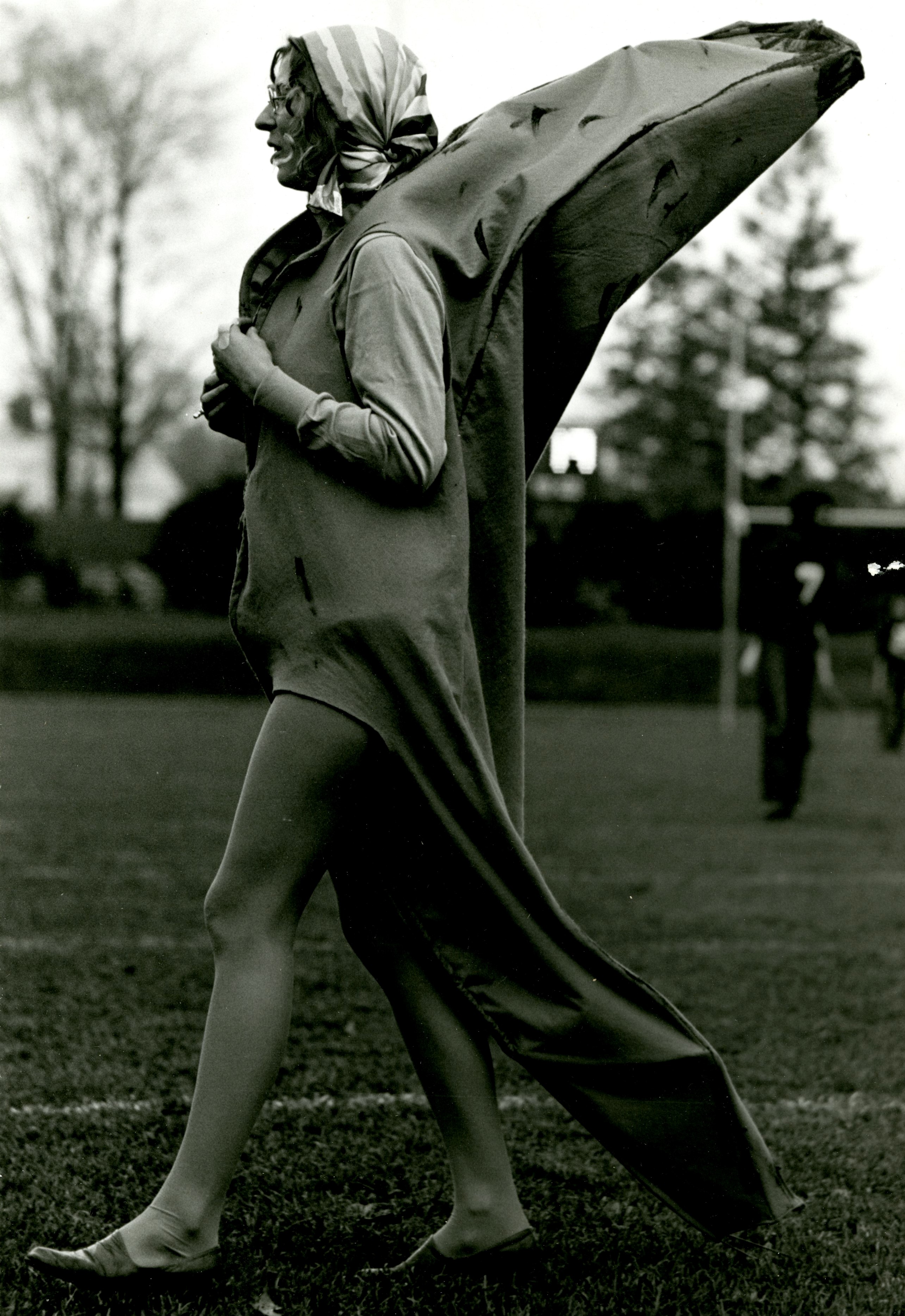
Emma Kay Szabados was a big hit as the Academy’s mascot banana. It is unclear why we were the bananas. Cranbrook Archives.
“Hog Butchers and Bananas were noticeably self-conscious when they trotted onto the field. But as the game progressed and the crowd of 300 cheered vociferously, players and spectators alike were caught up in the spirit of true athletic competition.
Quarterback George Sorrels used a “flexible formation from the pro set,” allegedly adapted from Detroit Lions plays by Coach Mel Baker. Cranbrook Archives.
“Cranbrook grabbed an early lead on the swift running of Nick Vettraino and the spectacular pass catching of Dick Ewen. But the Hog Butchers kept fighting back.
The crowd going wild as Cranbrook marches on to victory. Notice Gerhardt Knodel, Artist-in-Residence of the Fiber department (and future Director of Cranbrook Academy of Art) in the foreground. Cranbrook Archives.
“As darkness descended Cranbrook led 27-25 with time left for just one play. Chicago tried a field goal that would bring victory. The kick failed, and the pro-Bananas crowd flocked onto the field and hoisted heroes onto their shoulders.
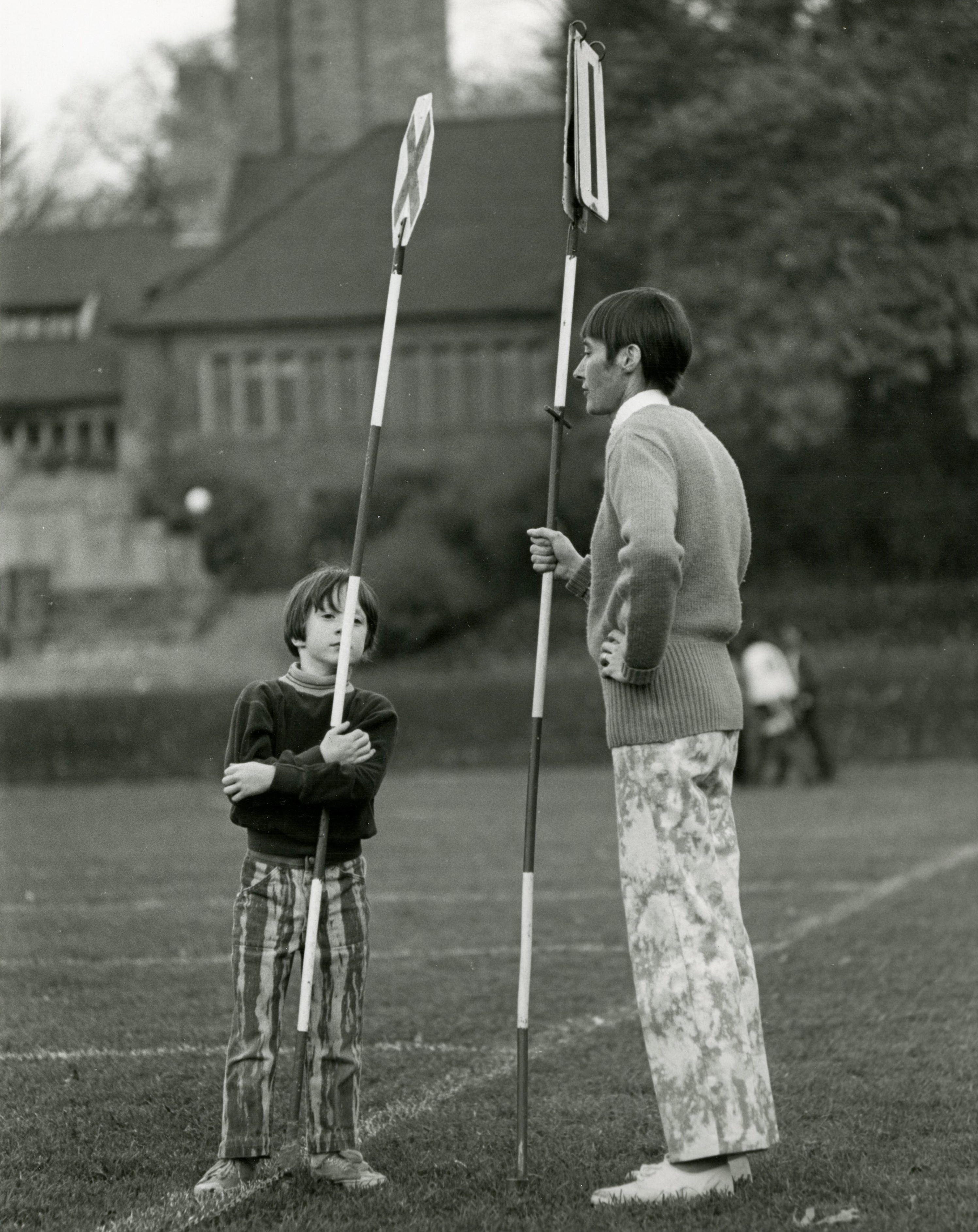
Patrick and Mary Mitchell, son and wife of Academy President Wallace Mitchell, manned the sideline markers. Cranbrook Archives.
“Art or not, it was a helluva weekend. And after it was all over the campus was permeated with a camaraderie never seen before in Academy history.”
As the Upper School kicks off its season against U of D Jesuit tonight, I’d like to wish everyone a happy football season (Go Cranes!) and welcome Schools and Academy students back to campus. Perhaps we will see a rematch of the Bananas and the Hog Butchers on the gridiron soon? If so, there’s a new press box from which to call the game. I volunteer to provide color commentary!
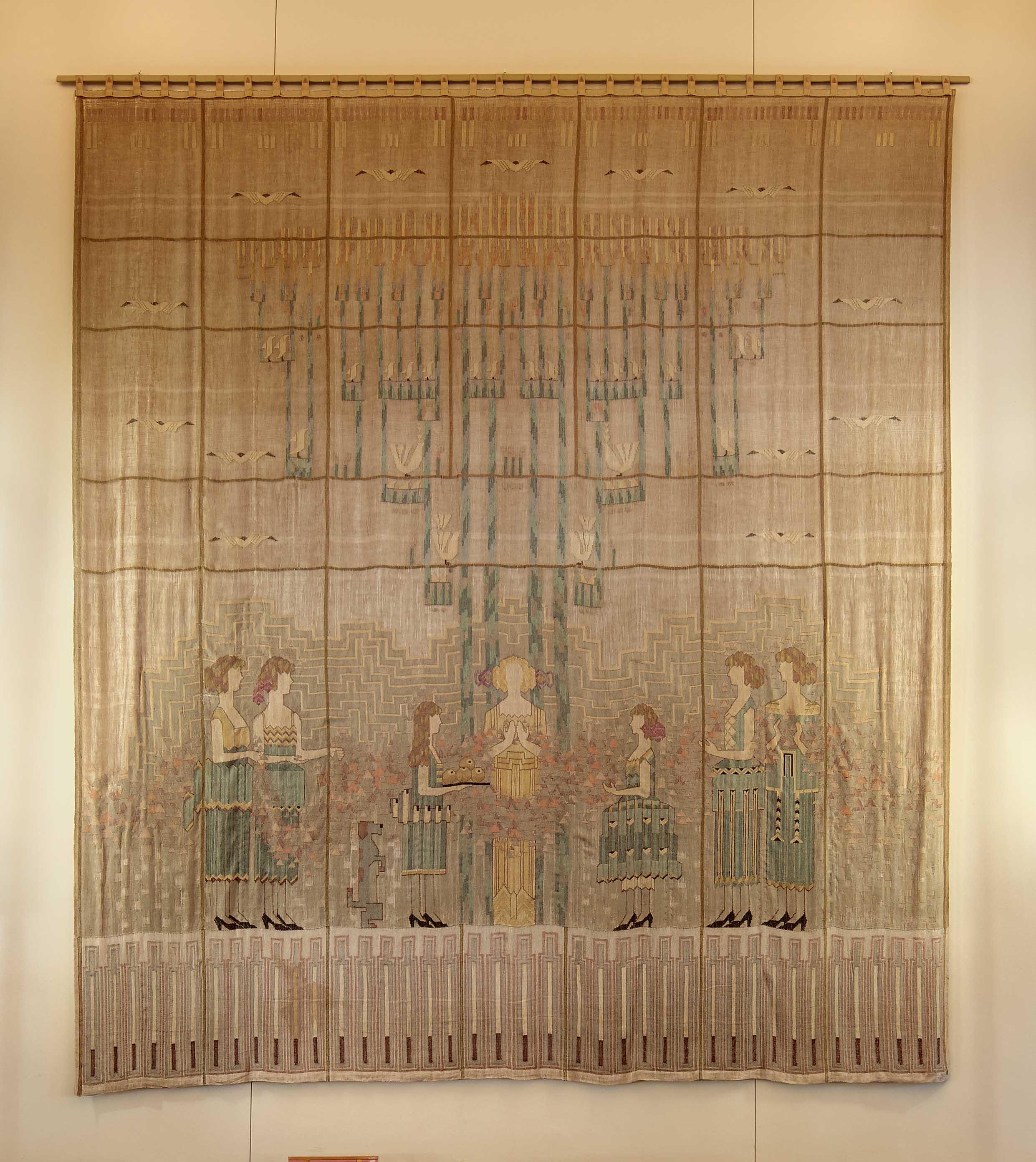
While Kingswood alumnae will recognize Studio Loja Saarinen’s largest weaving at Cranbrook, The Festival of the May Queen, did you know there’s an even larger piece by the studio off campus?
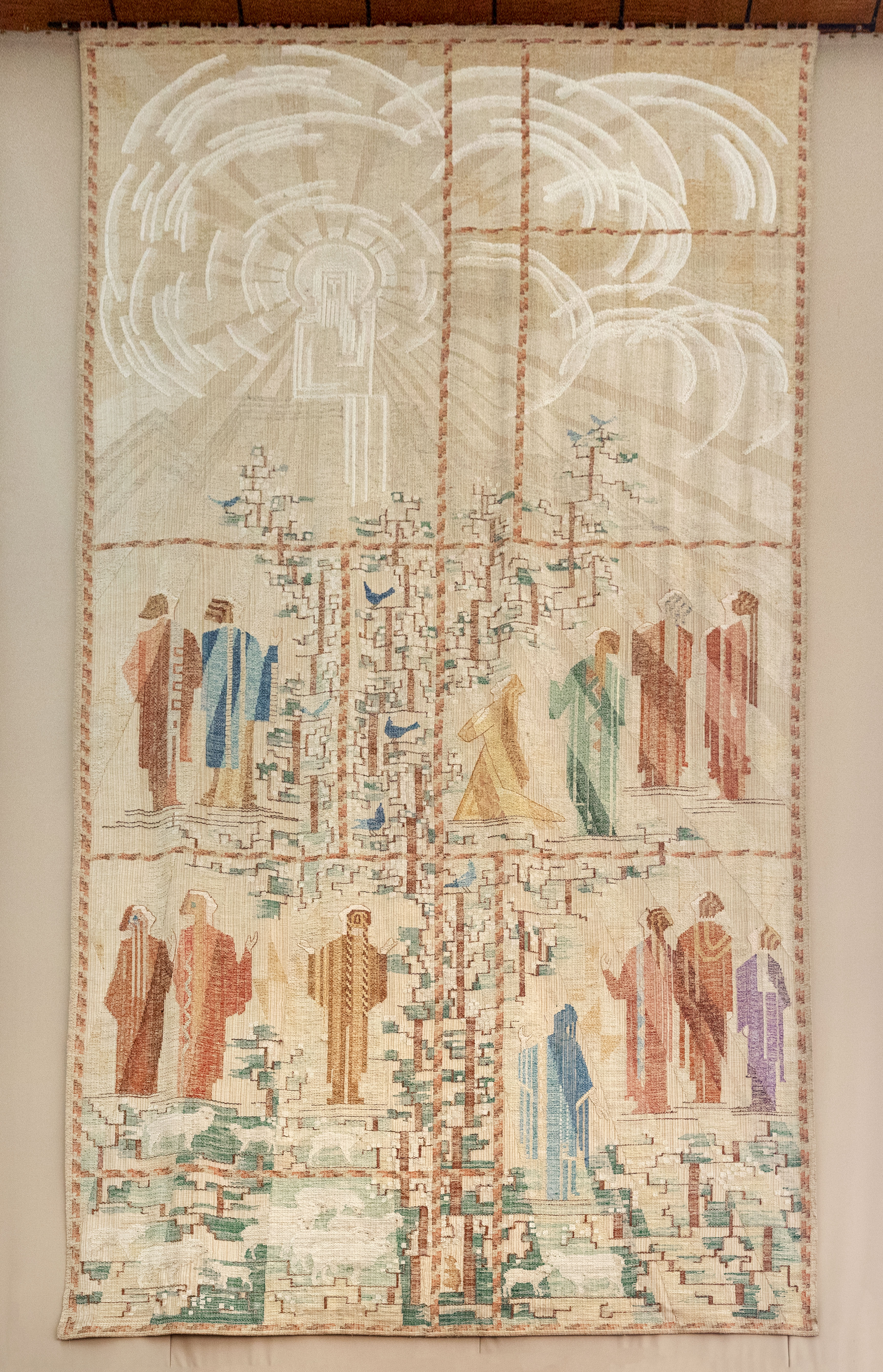
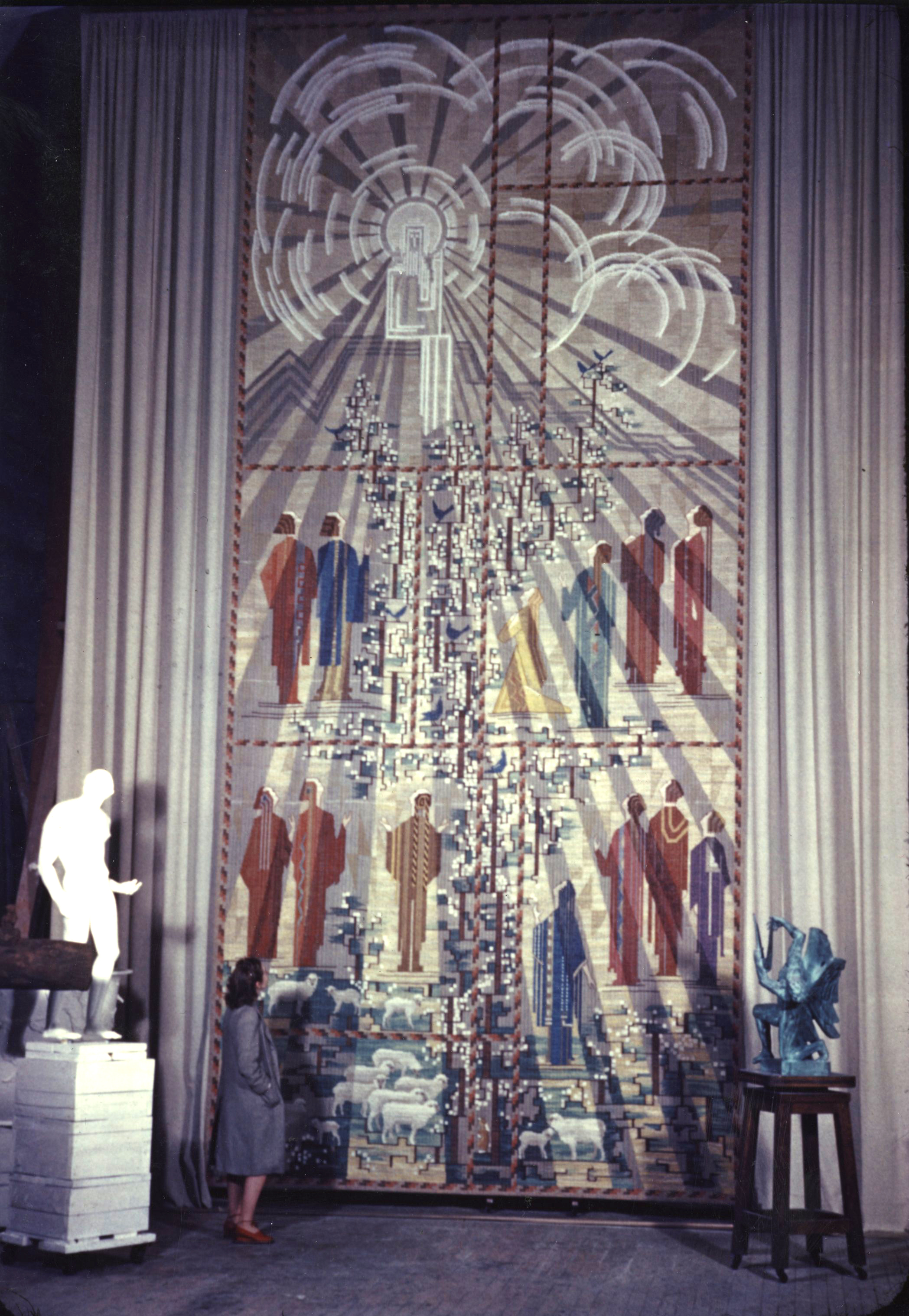
Ordered in connection with Eliel Saarinen’s commission for the Tabernacle Church of Christ in Columbus, Indiana (today the First Christian Church), the monumental Sermon on the Mount hanging was an artistic and technical triumph completed by Studio Loja Saarinen in 1941.
Interior view of First Christian Church, showing Studio Loja Saarinen’s The Sermon on the Mount hanging. 1942. Courtesy of Progressive Architecture.
The subject was chosen by the church, and according to their archives, the Sermon on the Mount was selected as a topic because it is “the ideal for human conduct.” The tapestry, they went on, would need to suggest “worship as well as obedience.”
Sketch for the The Sermon on the Mount, 1941. Eliel Saarinen (attributed). Pencil, colored pencil, and gouache on paper. 26 7/8 x 11 7/8 inches. Courtesy of Cranbrook Art Museum. Gift of Robert Saarinen Swanson.
Eliel Saarinen likely produced the sketch of the hanging, an unsigned colored pencil and gouache drawing now in Cranbrook Art Museum. Interestingly, this is the only textile with a religious subject to come out of the Saarinen studio.
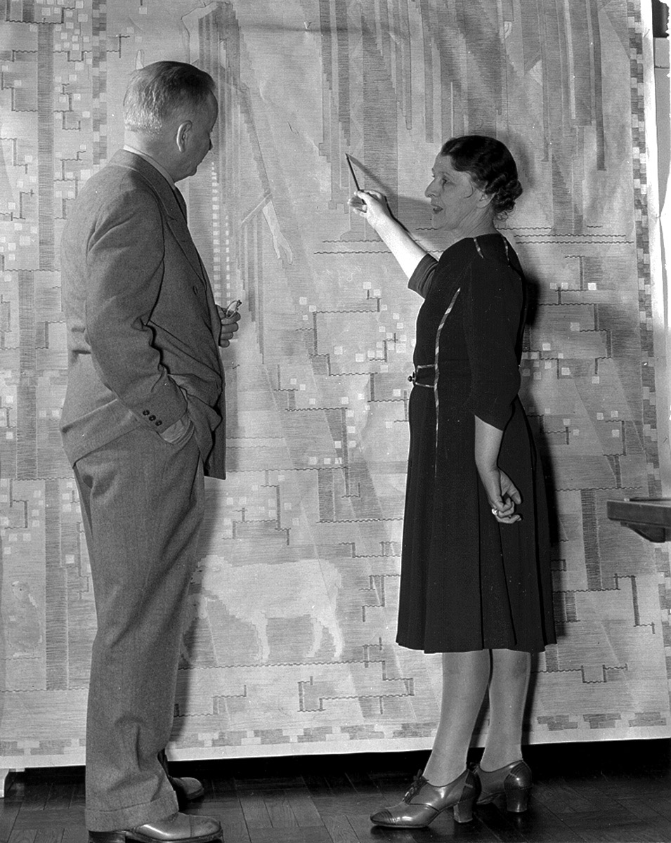
The small sketch was then enlarged onto full-size paper mock-ups, which allowed the Saarinens to review and edit the design and provided direction to the weavers at the loom.
Loja Saarinen showing Eliel a cartoon of their tapestry, The Sermon on the Mount, April 1941. Photo by Betty Truxell. Cranbrook Archives.
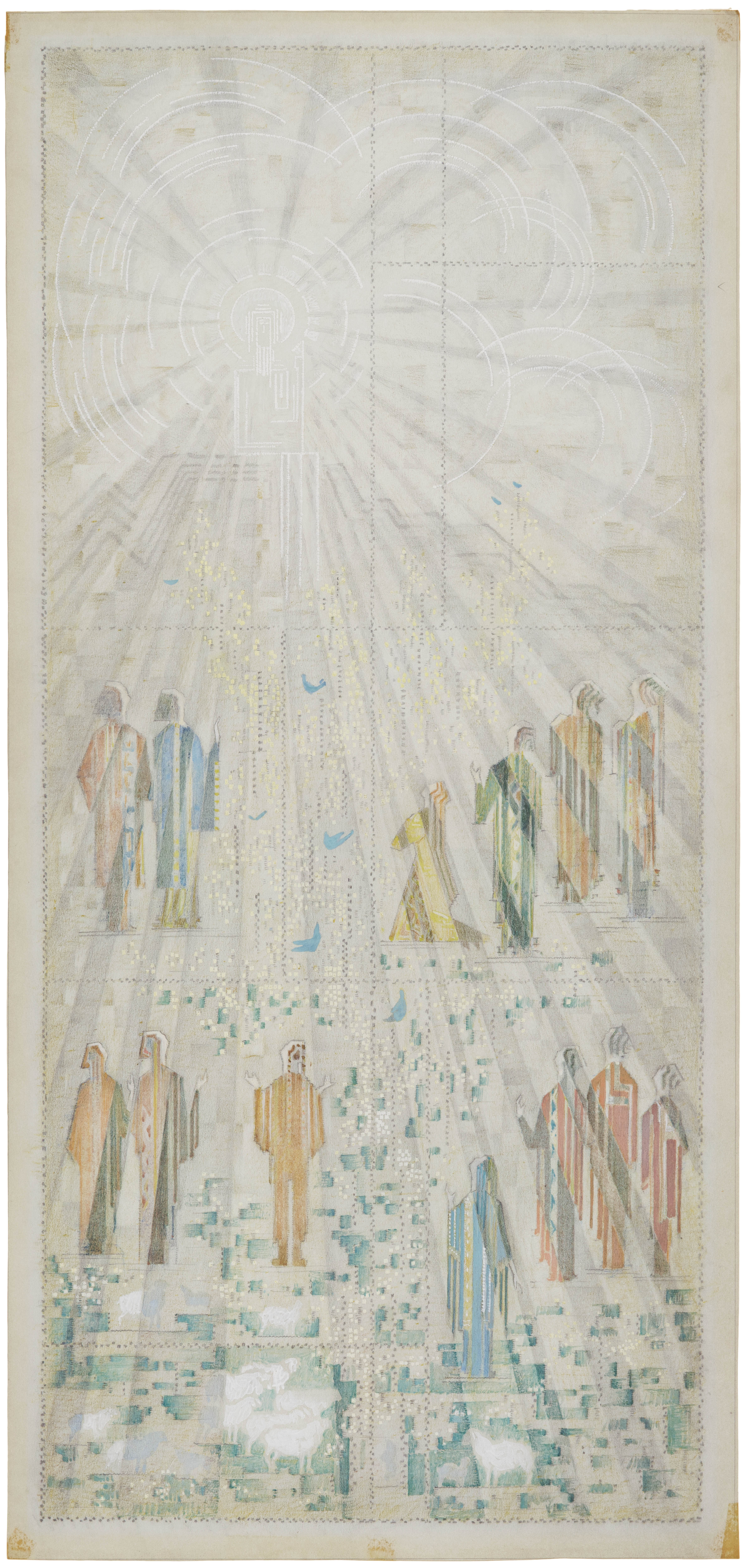
Thirteen patterned and colorfully-robed worshipers in two rows stand looking toward Christ, rendered in all white yarn on a cream background. Christ is surrounded by arcs and beams of white light that masterfully descend throughout the hanging, adding a rich depth to the composition.
The Sermon on the Mount Hanging. 1941. Loja & Eliel Saarinen (designers), Lillian Holm, Ruth Ingvarson (weavers). Wool and linen with supplemental wool weft; 12 x 27’. First Christian Church, Columbus, Indiana. Photo by Hadley Fruits.
Much like The Festival of the May Queen, the weaving is subdivided asymmetrically into rectangular shapes of varying dimensions by rhythmic bands of alternating rust, coral, and gold. These lines link into the scene’s landscape, which is made up of a series of highly stylized branches connecting green and white masses. These color-blocks sometimes read like meadows or hills; in other places, the green reads like flowering shrubs, climbing vines, or a branching tree. In the lower fields are sheep, as the tapestry moves up, birds rest within the branches.
Detail of The Sermon on the Mount showing the lambs, branches, and worshipers. Notice the rich variety of patterning and depth of color on the figures. Photo by Hadley Fruits.
These climbing, abstract elements helps provide movement and energy to the tapestry, balancing the white radiance of the Christ-figure with the wonder of nature. The movement of the geometric green, rust, and white blocks courses between the worshipers, much like the swag of triangles (are they flowers, butterflies, or perhaps something more abstract?) that flow through the maiden’s hands in the Festival of the May Queen hanging at Kingswood.
Festival of the May Queen hanging, 1932.
Loja & Eliel Saarinen (designers), Studio Loja Saarinen (production). Loose linen warp and weft of wool and synthetic yarns; 216 x 192.” Photo by James Haefner, Courtesy of Cranbrook Center for Collections and Research.
The Columbus tapestry was woven by two Swedish weavers who’d worked for Studio Loja Saarinen (intermittently) since 1929: Lillian Holm, who also taught at Kingswood from 1933 until 1966, and Ruth Ingvarson. After previous projects for Loja Saarinen had been met with less-than-thorough credit given to the weavers themselves, Holm and Ingvarson demanded acknowledgement from Loja Saarinen in the press materials, as well as on the weaving itself–supposedly, Holm wove her name into the tapestry in multiple places.
After Holm and Ingvarson had completed their work at the loom, Loja worked on the hanging for weeks, unrolling it section by section on a large table in her studio and accentuating the colors through the inlay of additional threads into the primary weave. This was possible because of the discontinuous weft, known as the Handarbetes Vanner (H.V.) technique after the Stockholm school where it was developed, used in all of Studio Loja Saarinen’s large hangings.
The hanging is labeled on the reverse, with an ink-signed piece of appliqued fabric label listing Eliel, Loja, Lillian, and Ruth and their roles. Everyone’s names were also included in the invitation to the hanging’s reveal at Cranbrook in the winter of 1942, where it was displayed in the forty-foot high studio of Carl Milles.
The Sermon on the Mount on display in Carl Milles’ Cranbrook studio. February 1942. Saarinen Family Papers, Cranbrook Archives.
Cranbrook neighbor and diarist Kate Thompson Bromley described the event in February 1942:
“It had been months in the weaving…One of the biggest tapestries woven in this country, and probably as beautiful as any, for the colors are soft and rich. The large studio [Carl Milles’] was the only place with a high enough ceiling at Cranbrook to hang it. At the end of that huge room it was decorative and glowing. It must have been a great happiness to the weavers to see it in place, for as they could only judge the section on which they were working.”
Once installed in Indiana, the weaving completed the remarkable church by Eliel Saarinen. Protected by curtains meant to shield the hanging from light and smoke, The Sermon on the Mount hangs opposite a wooden organ screen, which itself reads like a tapestry. Outside, the building façade and its glass-illuminated bell tower take on the grid and rhythm of weaving. Even the meandering lines and subtle arcs of the stone architectural ornament relates back to the design of The Sermon on the Mount.
In all its beauty, The Sermon on the Mount served as a high-point on which Loja Saarinen was forced to close her studio. As she wrote to George Booth, she was being “forced into” retirement because of a number of pressures: declining commissions, her husband’s exit from the Academy’s presidency, World War II, and a shift in focus for the Academy Weaving Department away from pictorial handweaving. Studio Loja Saarinen closed in 1942.
You can learn more about Studio Loja Saarinen, her weavers, and her products; see where the works were woven on campus; and visit Kingswood’s weaving studio and dining hall on my upcoming Behind-the-Scenes: Studio Loja Saarinen, 1928-1942 tours August 22 and 29. You can also experience the exhibition on any of our regular Saarinen House tours. If you find yourself in Indiana, see the Sermon on the Mount any Sunday at First Christian Church or through tours with Visit Columbus.
-Kevin Adkisson, Curatorial Associate
Special thanks to Cranbrook Academy of Art graduate Hadley Fruits (Photography, 1990) for the contemporary color photographs of The Sermon on the Mount and First Christian Church.
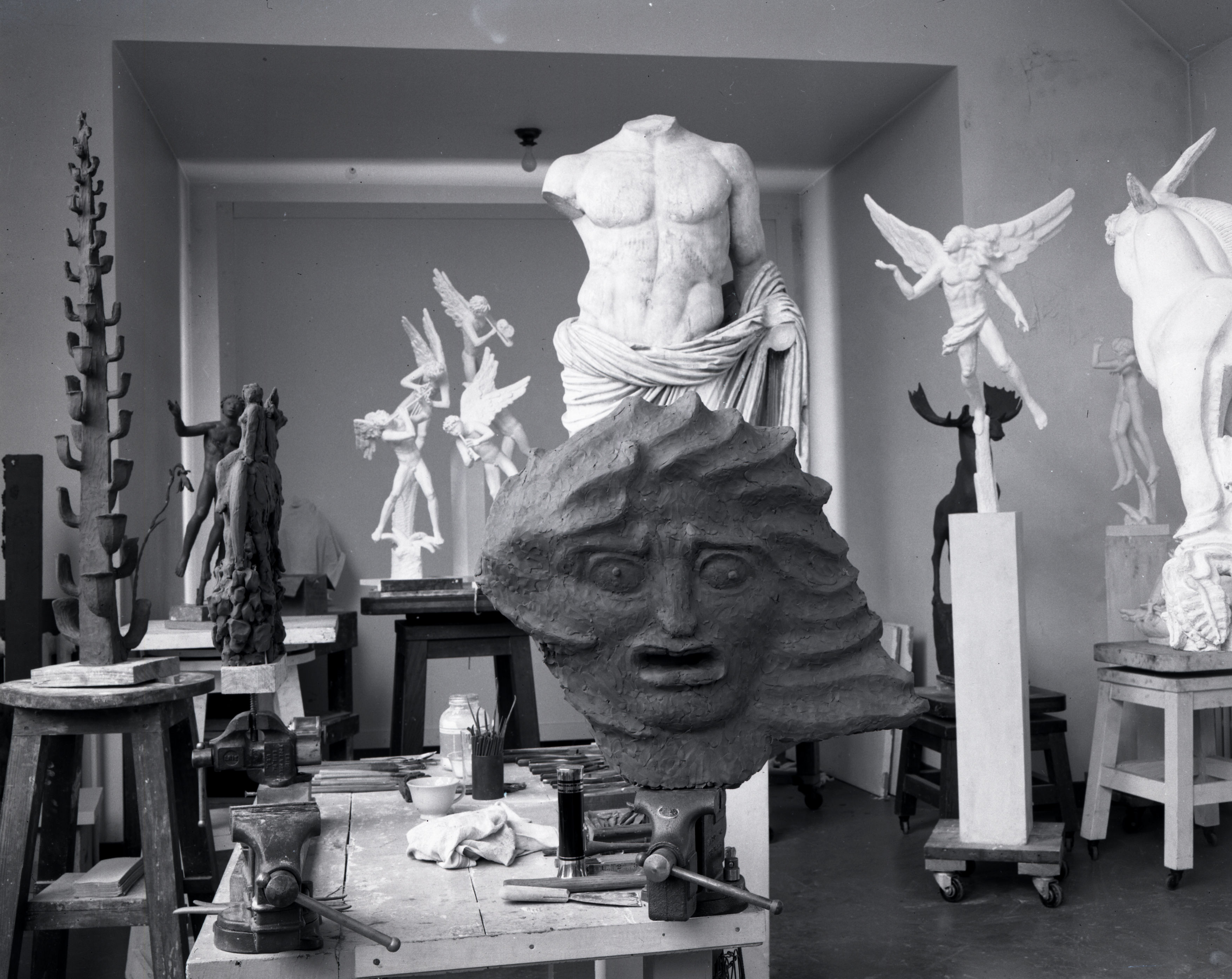
A research request put me in search of Carl Milles this week. In the process of research, I noticed again a short letter written by Milles to Richard Raseman, Executive Secretary and Vice President of the Cranbrook Academy of Art from 1932-1943, which demonstrates a wonderful sense of humor:
Letter from Carl Milles to Richard Rasemen, September 12, 1938: “Richard, Please Print in your shop following, [Please do not enter without knocking/please do not knock]. Big letter, thick bristol paper. I need 6 such prints. Carl.” Cranbrook Foundation Records, Copyright Cranbrook Archives.
While Cranbrook Archives does not have a discrete collection of Milles’ papers, there are many letters written by him to his friends and colleagues within several collections. For those minds that become curious to know more about Milles (who served as Head of the Department of Sculpture from 1931 to 1951), we have a subject guide to help in finding his handwritten treasures hiding within our collections. Milles’ letters show a great sensitivity to the recipient of his writing and his descriptions of the ups and downs of circumstance reveal a man of great warmth and fortitude.
View of various sculptures in side Carl Milles’ studio at Cranbrook Academy of Art, c. 1940. Harvey Croze, photographer. Copyright Cranbrook Archives.
I am often inclined to read the letters of an artist or historical figure alongside a study of their work in the world–what a person writes and how they write it provides a wonderful glimpse into a person, and enhances an understanding of the context of their work and deeds.
On the inside cover of the 1973/1975 Cranbrook Academy of Art Catalog is a hand-drawn, fold-out map of the campus. I’ve always liked this map, with its witty labels like “Brookside School for Little Kids” and “Another Famous Statue.”
Map of Cranbrook drawn by Edward Fella (CAA Design 1987), 1972. Printed on the inside cover of the 1973/1975 Cranbrook Academy of Art Course Catalog. Courtesy of Cranbrook Archives.
On the top left, you’ll see “Athletic Fields (Detroit Lions practice here).” The map also documents the neighborhood: on the far right, “Houses of the Bloomfield Hills wealthy” and on the bottom left, “Used to be orchards here, now houses.” If you look nearby, you’ll see “Map drawn by Edward Fella 1972.”
There are other labels that help expand our understanding of Cranbrook in 1972. The Old Water Tower(a thorn in Saarinen’s side) is still standing, and Cranbrook House is listed as “Booth Estate, Cranbrook House, now Institute for Pastoral Studies.” There are still tennis courts where the New Studios and Middle School for Girls would be built. There’s no label for Saarinen House, instead, sandwiched between the “Foundry Studio,” “Architecture,” “Ceramics,” “Fabrics,” and “Metalsmithing” reads a label for “President’s House.” (Wallace Mitchell was the Academy’s president at the time). Although there are lots of cars and some people—I spy football players, an entrance guard, and a life guard—the only proper name I see is “McCoy Studio.” This makes sense: Ed Fella was a frequent collaborator with, and later a student of, Katherine and Michael McCoy.
Edward Fella is a native of Detroit who graduated from Cass Technical High School in 1957. There, he studied lettering, illustration, paste-up, and other commercial-art techniques. He went directly from high school into advertising work as a commercial artist, working primarily for automotive and health-care clients. He had a successful career in advertising for almost three decades in Detroit.
In the early 1970s, the period in which Fella drew our map, he was working on freelance work between more conventional assignments. These pieces were often whimsical collages of photocopied materials with hand drawing and lettering additions. In 1970, Fella met Katherine McCoy (future Artist-in-Residence at Cranbrook) at Designers & Partners, his employer, in downtown Detroit. As McCoy recalled to Design Traveler last year, “I interviewed with the senior design partner, Al Evans, who offered me a job that day and introduced me to Ed Fella as I left. I recall a 32-year-old Ed sitting at his drawing board smoking his usual cigarette in his studio space right by the studio’s front door. I was 25 and very impressed by his wall of books, stacks of magazines, and graphic ephemera pinned up everywhere.” She noted that Fella was “already a Detroit advertising design celebrity.”
McCoy only worked at Design & Partners one year, leaving in 1971 to head Cranbrook’s design department with her husband Michael. There, she would often invite Fella to present his work to students and offer critiques. As McCoy told the American Institute of Graphic Arts (AIGA), “If anyone is meant to be a student and teacher in a rigorous educational environment, it’s Ed Fella. He was a powerful influence on our students.” It would have been around this time Fella was commissioned to produce the Cranbrook map for the 1973/1975 course catalog.
Cover, 1973/1975 Cranbrook Academy of Art Course Catalog, designed by Katherine McCoy. Courtesy of Cranbrook Archives.
After over a decade “hanging out” in the “hippie” and “loosely structured” atmosphere of Cranbrook (Fella’s words), in 1985 at the age of 47 Fella entered into the MFA program at Cranbrook. Although older than his fellow students (and his department heads), Fella didn’t view his years of professional practice as an advantage: “At Cranbrook, I really was fortunate to be in such an amazing class dynamic…I used to say, experience never trumps a great idea; a 20-year-old can have one as easily as a 40- year-old…and it was certainly the case in that class!” He immersed himself into the era’s discussions about the postmodern movement. At Cranbrook, he also studied photography with Carl Toth and attended discussions with architect Daniel Libeskind (meanwhile, Fella’s two daughters babysat Libeskind’s young children).
Throughout his career, Fella produced work for local art cooperatives and events, like the Detroit Focus Gallery, Detroit Artist Market, and Cranbrook. Over 100 of these posters were donated in 2012 to Cranbrook Art Museum. It is in the experimental nature of these posters where we can see how Fella perfected his art of distorting text and collaging high and low imagery.
Practice and Preach and Theorize and Teach! Edward Fella, American, 2004. One-color, offset-print on bond paper, 17 x 11 in. Gift of the Artist, Courtesy of Cranbrook art Museum.
In 1987 Ed Fella left Michigan to begin teaching design at the California Institute of the Arts. He recently retired from the school after a long career of mentoring and producing experimental works of graphic design. In 2014, he was awarded Cranbrook Academy of Art’s Distinguished Alumni Award. You can read and see more about Fella’s life, work, and education here in this excellent biography by Design Traveler.
Fella’s 2007AIGA medal biography summarizes Fella’s career as: “prodigiously mashing up low-culture sources with high-culture erudition, Fella’s work—perhaps more than that of any other contemporary designer—makes visible the postmodern concept of deconstruction, which recognizes that behind every articulated meaning is a host of other, usually repressed meanings, some antithetical. By battering and mixing fonts, engaging in visual puns and generally violating the tenets of ‘good design,’ Fella lets a thousand flowers bloom. His designs don’t cut through the clutter—they revel in it.”
I think this quite aptly summarizes the joy I find in Fella’s Cranbrook map of 1972: reveling in the mashup of landscape, architecture, activity, and text. Fella captures the diversity and beauty of this unique assemblage we call Cranbrook.
– Kevin Adkisson, 2016-2019 Collections Fellow, Cranbrook Center for Collections and Research
Congratulations to the Cranbrook Academy of Art students who graduated with their MFA’s and MArch’s today! The ceremony was held in Christ Church Cranbrook, after too much rain water-logged the Greek Theater. Did you know the ceremony used to be held in the library?
Although the Academy welcomed students in 1932, it first granted degrees in 1942 after being chartered by the State of Michigan as an institution of higher learning.
Cranbrook Academy of Art Convocation in the Academy of Art Library, May 1948. Harvey Croze, photographer. Copyright Cranbrook Archives.
The first convocations were held in the Academy Library. Here, in 1948, we see Henry Scripps Booth speaking, with Zoltan Sepeshy seated to his far left and Carl Milles and Eliel Saarinen to Booth’s right. In the foreground of the image, bursting with blooms, is Maija Grotell’s blue and platinum vase of around 1943.
– Kevin Adkisson, 2016-2019 Collections Fellow, Cranbrook Center for Collections and Research


